
 By Siti Muinah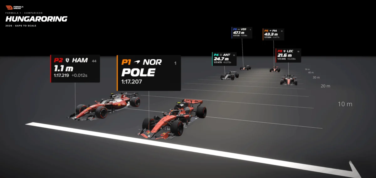
In the high-speed theatre of modern Formula 1, fractions of a second dictate glory and despair. Yet, when a television broadcast flashes a timing delta like “+0.012s” across the screen, it rarely registers as a visceral experience for the viewer. It is an abstract quantity—a disembodied numerical value that floats briefly in the ether before vanishing into the noise of the race.
Human cognition is inherently ill-equipped to feel numbers in a vacuum. We struggle to picture twelve thousandths of a second because our evolutionary wiring has no sensory benchmark for it. But when an abstract metric is translated into a physical distance and drawn faithfully to scale, a number nobody can feel transforms into a reality that anyone can see.
This challenge—bridging the chasm between raw metrics and human intuition—remains one of the most persistent hurdles in professional data visualization. By examining recent innovations in sports analytics, specifically through the lens of motorsport qualifying gaps, we can uncover a powerful framework for making complex data instantly understandable.
Main Facts: The Anatomy of a Qualifying Gap
To understand the mechanics of this visualization shift, consider the qualifying session of the 2026 Hungarian Grand Prix. During this high-stakes outing, British driver Lewis Hamilton secured second place on the grid. The official timing screen recorded his deficit to pole position as a razor-thin 0.012 seconds.
To the average fan, “+0.012s” is a cipher. However, applying a simple conversion formula changes the narrative entirely. At the point where a Formula 1 car crosses the start-finish line, it travels at roughly 300 kilometres per hour—translating to approximately 83 metres every single second. When Hamilton’s time deficit of 0.012 seconds is multiplied by this velocity, the abstract unit of time becomes concrete space: 1.1 metres.
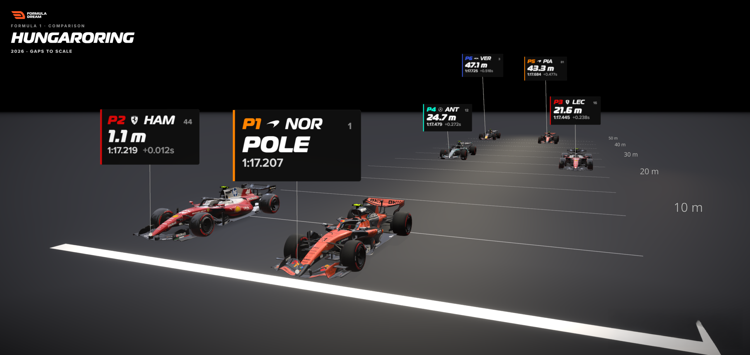
Suddenly, the numbers acquire a physical form. One point one metres is roughly the length of a racing car’s nose. Rather than staring at two disconnected time stamps, the reader can visualize two vehicles nearly level with one another, one slightly edging out the other as they cross the white line. Nothing about the underlying data changed. Only the unit of measurement did.
Chronology: The Evolution from Timing Screens to Track Scales
The traditional method of communicating qualifying performance has relied heavily on chronological timing tables and static bar charts. For decades, sports broadcasters and digital journalists have presented qualifying results as a vertical or horizontal sequence of numbers.
[ Pole Position ] ------------------------- (Reference)
[ 2nd Place: Hamilton ]  +0.012s
[ 3rd Place: Leclerc    ]  +0.238s
[ 4th Place: Verstappen ]  +0.518s
While these lists are accurate and rank drivers correctly, they suffer from a fundamental flaw: a bar chart is not a physical place. When viewers look at a traditional bar chart comparing the top six drivers at the 2026 Hungarian Grand Prix, they see a series of proportional rectangles. They can deduce that sixth place was significantly slower than second place, but they possess no intuitive sense of the physical gulf separating them on the asphalt.
Recognizing this perceptual disconnect, sports data platform Formula Dream developed the interactive Gap Visualizer Tool. Instead of mapping time deltas onto arbitrary horizontal bars, the tool projects the cars back onto a to-scale representation of the track’s main straight.
By anchoring the pole-sitter’s nose to the finish line and plotting trailing cars backward using metered distance markers spaced every five metres, the visualization allows empty space to do the heavy lifting. The result is an immediate, visceral understanding of the grid’s spread.

Supporting Data: The Mathematics of Motion
The mathematical engine driving this transformation is deceptively simple. Transforming time into distance relies on a straightforward calculation:
$$textDistance in metres = textGap in seconds times left(fractextSpeed in km/h3.6right)$$
In the context of the 2026 Hungarian Grand Prix analysis, the reference speed is not an arbitrary top speed or a generalized lap average. It is the precise, empirically measured speed of the pole-sitting car as it crossed the speed trap situated near the start-finish line during its fastest lap.
Using this methodology, the data for the top six qualifiers reveals a dramatic spatial narrative:
- 1st to 2nd (Hamilton): 0.012 seconds $rightarrow$ 1.1 metres (A car’s nose; locked in an intense gearbox-to-gearbox duel).
- 1st to 3rd (Leclerc): Roughly a quarter of a second $rightarrow$ Over 20 metres (A substantial buffer of empty asphalt).
- 1st to 6th (Verstappen & others): Covered by barely half a second on the timing screen $rightarrow$ Nearly 50 metres of total spread across the tarmac.
Acknowledging Model Constraints and Honest Modeling
Rigorous data journalism requires absolute transparency regarding the limitations of any visual model. A freeze-frame visualization carries specific trade-offs that must be clearly communicated to the audience:

- The Single-Speed Assumption: The visualization assumes that all trailing cars were traveling at the reference car’s line speed at the exact moment of crossing. In reality, qualifying gaps are accumulated across winding corners and varying elevation changes throughout the entire lap. Applying a single straight-line speed to represent the whole lap is an approximation—yet near the finish line, flat out, it remains the most honest representation possible.
- Sidereal Offsets for Visibility: In top-down or perspective track drawings, cars must be nudged slightly sideways so they do not overlap entirely on top of one another. This lateral offset carries no data; it is an aesthetic concession designed purely to ensure every car remains visible to the reader.
By openly stating these boundaries, visual designers maintain trust. The core ethos of the model remains intact: the gaps are real, the proportions are mathematically sound, and the track layout serves as an intuitive illustrative medium.
Official Responses and Industry Perspectives
Data visualization experts and sports analysts have increasingly embraced the philosophy that human intuition should dictate design choices rather than raw numerical precision.
Bhavin Lathia, creator of Formula Dream, notes that traditional sports analytics often alienate casual fans by prioritizing dense, uncontextualized metrics. "When you make dense sports data feel intuitive, you open the door for people who aren’t data experts to genuinely feel the narrative of the sport," Lathia explains. "A hundredth of a second is an abstraction. A car’s nose is a physical reality. Our job is to bridge that gap."
Industry feedback suggests that spatializing time deltas dramatically increases user engagement. Viewers who previously glossed over timing sheets report a sudden, sharp appreciation for the fine margins of elite motorsport engineering when those margins are rendered as physical distances they can mentally pace out.
Implications: Beyond Motorsport
The principle of translating invisible, abstract units into tangible physical spaces extends far beyond Formula 1. Across various disciplines of data journalism, the same underlying rule applies: Find the rate that turns your abstract unit into something the human body inherently understands, and draw it to scale.

- Urban Planning & Transit: Commuter maps that display walking times and physical distances between stations consistently outperform those that merely list sequential stop counts. Readers grasp "a 15-minute walk" faster than "three intermediate nodes."
- Environmental Science: Geographical areas described in square kilometres often fail to register with the public. Translating deforested zones into familiar landmasses—such as "an area the size of Wales"—provides an immediate cognitive anchor.
- Finance and Economics: Macroeconomic debt figures or corporate expenditures can be visualized through physical analogies, such as stacking currency rolls or comparing lengths against familiar architectural landmarks.
The Ultimate Takeaway
When data fails to resonate with an audience, the default instinct among creators is often to double down on precision: adding more decimal places, increasing font sizes, or packing charts with exhaustive annotations.
The superior approach is frequently the exact opposite. Ask what physical equivalent your abstract quantity possesses, and hand the reader that spatial metaphor instead. The underlying data remains entirely untouched, but by giving the numbers a physical body, you allow human intuition to supply the meaning.
Next time a dataset fails to land, do not just display the numbers—give them a distance.
 Lina Irawan
  Nana
Nana  Nila Kartika Wati