
 By Asep Darmawan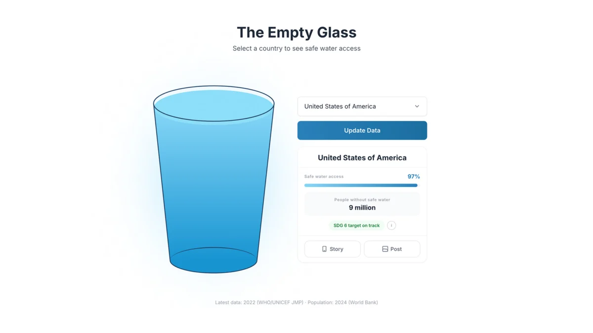
In an era defined by the "Big Data" revolution, we are drowning in information but starving for insight. From sprawling interactive dashboards to dense, multi-layered choropleth maps, the standard approach to data journalism often prioritizes raw complexity. We demand accuracy, granularity, and technical precision. Yet, there is a fundamental paradox in modern analytics: the more data we present, the more detached the audience becomes from the human reality behind the digits.
When a report states that a nation has 60% access to safe drinking water, the figure is technically precise, yet emotionally vacant. It is an abstract percentage that fails to evoke the visceral, lived experience of scarcity. Recognizing this cognitive and emotional disconnect, multidisciplinary designer Inumimo Idowu launched The Empty Glass Project—a daring, minimalist intervention in data visualization that seeks to replace abstract statistics with the universal, evocative power of a simple glass of water.
The Core Problem: Information Without Connection
The global water crisis is perhaps the most heavily documented development issue of the 21st century. Trusted organizations, including the World Health Organization (WHO) and UNICEF, provide robust, high-fidelity datasets that track the progress of nations in meeting the Sustainable Development Goals (SDGs). However, despite this wealth of information, the issue remains stubbornly distant for the average reader in the developed world.
Traditional data visualization tools, such as heat maps or bar charts, require a high level of "data literacy." They force the viewer to engage in a mental translation: What does this color represent? How does this bar length compare to the threshold of "safe"? For most people, this cognitive labor acts as a barrier. The visualization becomes a hurdle rather than a bridge.
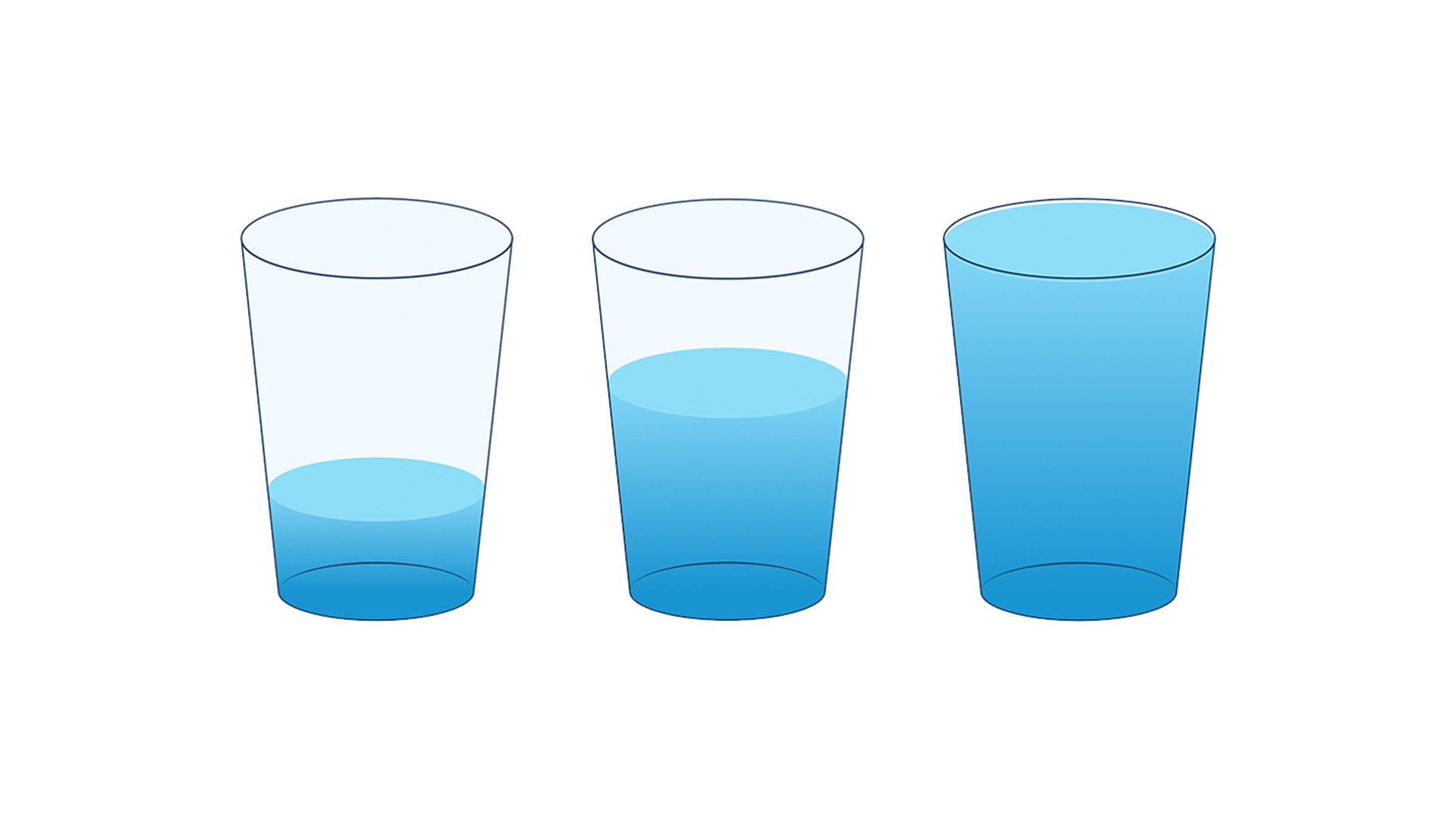
The Empty Glass Project challenges the industry-standard obsession with "completeness." By stripping away legends, axes, and complex color scales, Idowu’s project forces a direct encounter between the viewer and the reality of water access. The metaphor is elementary yet profound: a glass is a vessel of life, a daily object of necessity that everyone understands. By turning that object into a barometer of inequality, the project bypasses the brain’s analytical defenses and speaks directly to human empathy.
A Chronology of the Project’s Evolution
The genesis of The Empty Glass Project was not rooted in a desire to build a more complex dashboard, but in the frustration of watching critical humanitarian data go ignored.
- Phase One: Identification of the Gap: In early 2026, Idowu began analyzing the efficacy of existing humanitarian data portals. He observed that while professionals used these tools to track development progress, the general public rarely engaged with them for more than a few seconds. The data was "seen" but not "felt."
- Phase Two: Concept Synthesis: The shift toward the "glass" metaphor occurred during an iterative design session. The goal was to find a singular, universal symbol for hydration. The glass emerged as the perfect candidate—it is culturally agnostic and physically representative of the volume of water needed for basic survival.
- Phase Three: Prototyping for Intuition: During the mid-2026 development phase, the team tested various visual iterations. They moved away from complex charts and focused on the fluid, interactive animation of water levels. The design was stripped of all extraneous information, ensuring that the user’s primary focus remained on the emptiness or fullness of the vessel.
- Phase Four: Public Launch and Engagement: Upon its release, the project gained traction not as a data repository, but as a digital experience. It shifted the discourse from "How many people are affected?" to "What is the daily reality of these individuals?"
Supporting Data and the Logic of Minimalism
The power of The Empty Glass Project lies in its restraint. In traditional data design, information density is often equated with quality. However, psychological research into cognitive load suggests that when we are presented with too much information, our ability to form an emotional connection to that information decreases.
The Science of "Less is More"
By removing the "noise" of grid lines and labels, Idowu allows the viewer to focus on the disparity. When a user toggles between countries, the rapid change in water levels creates an immediate, visceral reaction.

- The 60% Problem: If a bar chart shows 60%, the eye registers it as a mid-tier value.
- The 60% Experience: When a glass is filled only to the 60% mark, the viewer sees the "empty" space as a deficit. It creates an intuitive sense of lack that a percentage sign simply cannot convey.
The project relies on a foundational dataset provided by international aid agencies. While the presentation is stripped down, the accuracy remains absolute. This is the critical balance: the project does not lie about the data; it clarifies the narrative of the data.
Official Responses and the Future of Humanitarian Reporting
The design community and humanitarian organizations have responded to The Empty Glass Project with significant interest. Experts in data visualization have praised the project for "humanizing the spreadsheet," while development NGOs have noted that such tools are vital for fundraising and advocacy.
"The challenge with international development is that the scope of the problem is too large to comprehend," says one policy analyst familiar with the project. "When you talk about millions of people without water, the number loses meaning. When you look at an empty glass, you understand the personal tragedy immediately. That is the kind of impact that drives policy change and public donations."
However, the project is not without its critics. Some purists argue that minimalism can be dangerous, potentially oversimplifying complex systemic issues such as infrastructure decay, climate change, and political corruption. Yet, Idowu defends the approach, noting that his project is not intended to replace the deep-dive research of WHO or UNICEF, but rather to act as a "gateway" that encourages deeper investigation.

Implications for the Future of Data Design
The implications of The Empty Glass Project reach far beyond the water crisis. It suggests a new paradigm for data storytelling that is currently being adopted by various creative agencies and NGOs.
1. The Shift to "Emotional Data"
We are entering a phase where the effectiveness of a visualization will be measured not by how much data it contains, but by how effectively it moves the viewer to action. Designers are increasingly tasked with finding the "metaphor of the issue."
2. The Death of the Dashboard
The "Dashboard Era," characterized by infinite tabs and dropdown menus, may be reaching a point of diminishing returns. As mobile-first design becomes the standard, the ability to deliver a clear, singular, and impactful message on a small screen is becoming a critical skill.
3. Empathy as a Design Metric
In the past, metrics for success were accuracy, speed, and comprehensiveness. Moving forward, "empathy" must be included as a core design metric. If a user walks away from a data visualization without a change in their perspective or a sense of urgency, the design has failed, regardless of its technical brilliance.

Conclusion: The Power of Simplicity
The success of The Empty Glass Project serves as a stark reminder to the design community: complexity is often a mask for a lack of clarity. By reducing the global water crisis to a simple, empty glass, Inumimo Idowu has demonstrated that the most effective way to communicate a complex issue is to make it feel deeply, undeniably human.
As we look toward a future where we will be bombarded with even more data, the role of the designer is not to provide more information, but to provide more meaning. We must stop asking, "How do we show all this data?" and start asking, "What does this data feel like?"
When we find the answer to that, we move beyond simply informing our audiences—we connect with them. And in a world filled with abstract statistics, that connection is the only thing that truly matters. The empty glass is no longer just a digital graphic; it is a call to action, a reminder that behind every data point lies a life, and that even the smallest, most simple design can have the largest, most profound impact.
 Lina Irawan
  Nana
Nana  Nila Kartika Wati