
 By Nila Kartika Wati
When Coca-Cola announced its latest global brand refresh this past July, the company described it as a quest to make the world’s most recognizable soft drink look “more Coca-Cola.” The goal was to unify a fragmented visual identity into a singular, bold system. Yet, three months into the rollout, what was intended as a masterclass in brand consistency has ignited a firestorm of consumer frustration. In prioritizing a sleek, minimalist aesthetic, Coca-Cola may have inadvertently created a significant user experience (UX) failure: the new, hyper-similar packaging has made it increasingly difficult for consumers to distinguish between standard Coca-Cola and its sugar-free counterpart, Coke Zero Sugar.
A Chronology of the “Zero” Evolution
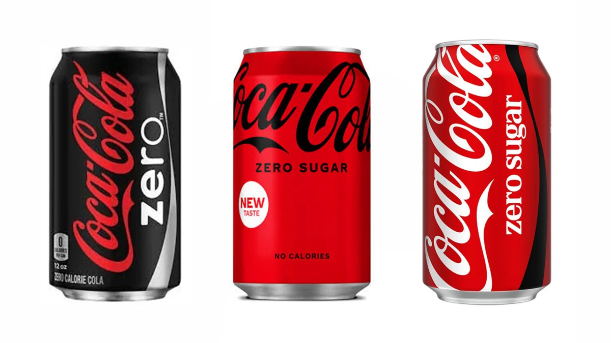
To understand why this current redesign is causing such friction, one must look at the evolution of the “Zero” product line. When Coca-Cola Zero launched in 2005, it was positioned as a radical departure from the flagship brand. To ensure consumers understood they were purchasing a product that tasted like the original but contained no sugar, the company utilized a bold, all-black can. This high-contrast packaging served as a vital visual signifier in the crowded landscape of supermarket shelves and vending machines.
In 2016, the brand underwent a significant shift, rebranding to "Coca-Cola Zero Sugar" and transitioning from an all-black can to a red design with a black logo. The intention was to lean into the iconic "Coca-Cola Red" while maintaining a black accent to denote the sugar-free status.
The current 2024 iteration, however, represents the most extreme narrowing of this visual gap. The black logo has been largely replaced by a subtle black ribbon or minimalist text, stripping away the primary visual anchor that once allowed for split-second identification. For the average consumer, this evolution appears to be a step toward total visual assimilation, moving away from distinct product differentiation toward a "one-brand" aesthetic.
The Human Cost: Practicality vs. Minimalism
Design is often described as the silent ambassador of a product, but when that design hinders the user’s ability to complete a simple transaction, it ceases to be an asset and becomes a liability. The backlash has not been confined to design forums; it has spilled over into the public sphere, led by those who interact with these products most frequently.
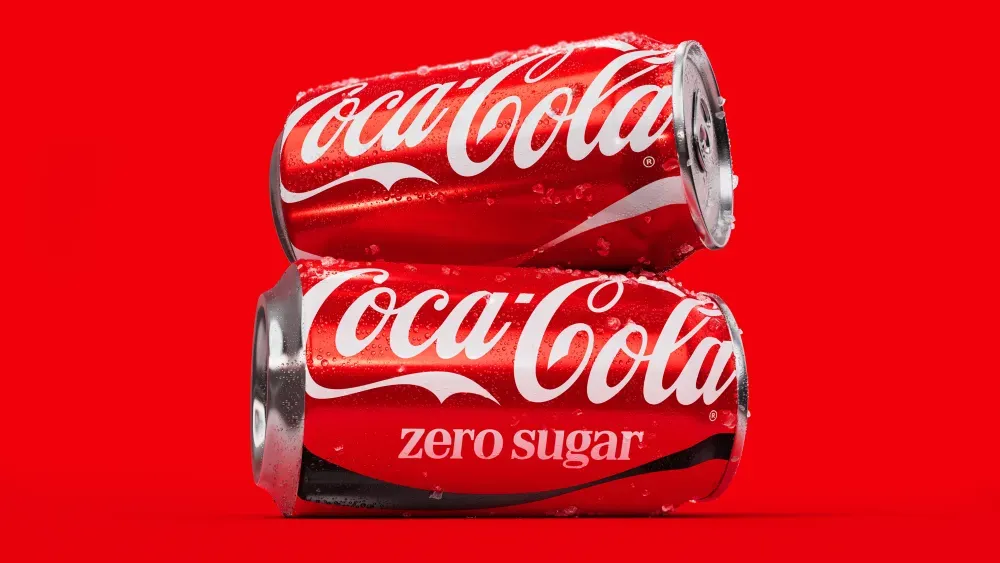
An Australian flight attendant recently went viral on TikTok after posting a video highlighting the difficulties of the new design. In the clip, she expressed that she has "lost count of how many wrong Cokes" she has handed out to passengers in a single week. For a flight attendant, where service speed is paramount and the lighting in a cabin can be dim, the subtle differences between the new cans are almost impossible to discern at a glance.
This anecdotal evidence is supported by a growing chorus of consumer complaints that highlight a more serious dimension to the design change: public health.
The Allergy and Medical Concern
For many, the distinction between Coca-Cola and Coke Zero Sugar is not a matter of taste preference, but a health necessity. Social media threads on platforms like Reddit and X (formerly Twitter) are filled with testimonies from diabetics who rely on the black lettering to manage blood glucose levels, and individuals with severe allergies to specific artificial sweeteners found in the zero-sugar variants.
"I rely on that black lettering for Zero because I’m diabetic," one user noted in a widely circulated comment. "Why on earth would they do that?" Others have pointed out that in a high-pressure retail environment, such as a busy restaurant or a crowded convenience store, the potential for a mix-up is dangerously high. When a brand’s visual identity is so streamlined that it masks the functional differences between its products, it risks alienating the very demographic that relies on clear, instant communication of product ingredients.
The Corporate Rationale: The Quest for "One Brand"
Coca-Cola’s official stance on the redesign remains steadfast. According to the company’s internal communications and public press releases at the time of the launch, the objective was "consistency." The goal is to deliver "one recognizable brand experience to consumers" through a seamless visual identity.
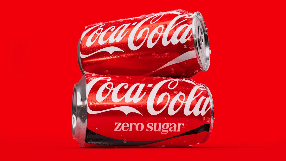
From a marketing perspective, the logic is sound. By reducing the visual noise and anchoring all products under the "Coca-Cola" name, the company is attempting to strengthen the master brand. In theory, this helps the company pivot away from a collection of disparate sub-brands and toward a unified, powerful entity. However, this strategy assumes that the consumer’s primary goal is to interact with the "brand experience" rather than to retrieve a specific product.
The "Conspiracy" of the Pivot: Phasing Out Sugar?
Beyond the immediate confusion, a deeper debate has emerged regarding Coca-Cola’s long-term corporate strategy. On various online forums, observers have speculated that the homogenization of the packaging is a deliberate, calculated move to shift consumer behavior.
The theory suggests that by making the standard sugary Coke and the Zero Sugar version look nearly identical, Coca-Cola is attempting to "nudge" customers toward the sugar-free option without them noticing. With governments worldwide implementing sugar taxes and tightening regulations on the advertising of high-sugar products, there is a clear economic incentive for the company to prioritize its zero-sugar portfolio.
Could this be a slow-burn strategy to eventually phase out the traditional, sugar-laden version of the drink? While Coca-Cola has never publicly suggested such an intention—and has, in fact, recently reinvested in the "classic" formula by producing sugar-cane-sweetened versions in the U.S. to cater to premium markets—the visual drift remains suspicious to many. If the packaging is designed to be interchangeable, it logically follows that the brand may eventually view the two products as interchangeable in the eyes of the market.
Design Implications: When Simplicity Becomes Obscurity
The Coca-Cola situation serves as a poignant case study for the modern design industry. In an era where "less is more" has become the governing principle of branding, this case demonstrates that there is a limit to how much information can be removed before a product becomes unrecognizable.
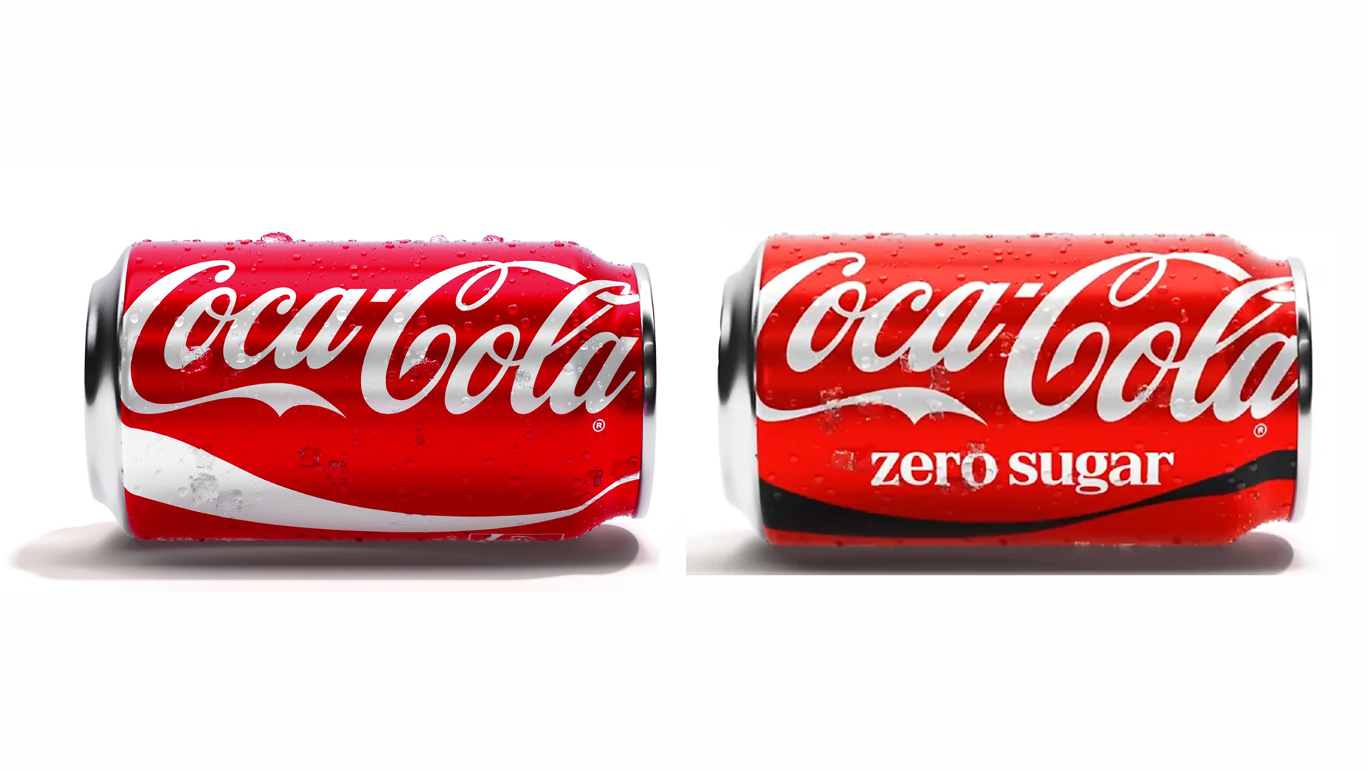
- The Principle of Differentiation: A brand must balance aesthetic unity with functional distinction. When a product line includes items with fundamentally different ingredients or nutritional profiles, the visual differences must remain high-contrast and easy to identify.
- Contextual Usability: Designers often test branding in controlled environments—high-resolution digital mock-ups or well-lit studio settings. They rarely account for the "real-world" context of a dim airplane cabin, a frantic checkout counter, or a user with vision impairments.
- The Power of User Feedback: This redesign illustrates that, in the age of social media, the feedback loop between the corporation and the consumer is instantaneous. When a brand ignores the functional needs of its users for the sake of a "clean" look, the backlash can quickly undermine the millions of dollars spent on the rebrand itself.
Conclusion: A Lesson in Brand Equilibrium
Coca-Cola stands at a crossroads. While the company has achieved its goal of creating a "more Coca-Cola" brand identity, it has done so by sacrificing the clarity that once defined its product hierarchy. Whether this confusion is an unfortunate side effect of a global design strategy or a subtle, long-term nudge toward a sugar-free future, the result remains the same: a frustrated consumer base.
For the design community, the lesson is clear: aesthetics cannot exist in a vacuum. A brand’s duty is not just to look cohesive, but to be usable. As Coca-Cola moves forward, it will likely need to find a way to reintroduce functional cues—perhaps through bolder contrast or more distinct secondary color coding—if it hopes to maintain its reputation for delivering a seamless, reliable experience. Until then, the "red ribbon dilemma" serves as a reminder that even the world’s most powerful brands are not immune to the fundamental rules of good design.
 Iffa Jayyana
 Reynand Wu
