
 By Nana Muazin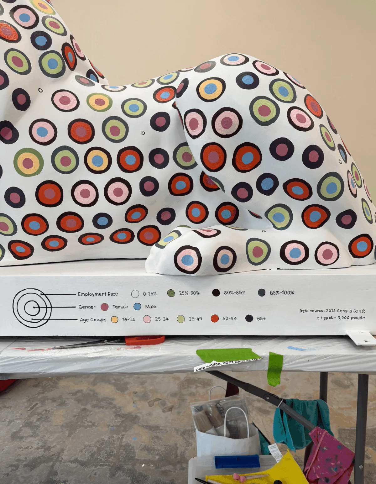
In the summer of 2026, the streets of Portsmouth were transformed into an open-air gallery. As part of the "Portsmouth 100" celebrations—a landmark centennial event honoring the city’s rich heritage—45 fiberglass lion sculptures were placed throughout the city. While these sculptures serve as a visual celebration of community spirit, one particular lion stands apart, not just as a piece of public art, but as a complex, physical manifestation of census data. Created by data visualization expert and artist Or Misgav, the "Data Lion" represents a bridge between the cold, objective world of statistics and the warm, vibrant identity of a city.
A Vision Born from a Scrolling Screen
The genesis of the project was as modern as the artwork itself. While scrolling through her phone one evening, Misgav encountered a call for artists for the "Pride of Portsmouth" trail. Her professional instincts immediately shifted from passive consumption to an analytical framework.
"Could I use a three-dimensional canvas to advocate for data art?" she pondered. "Could I use this opportunity to create a data-viz love letter for my city?"
The "Pride of Portsmouth" trail, which officially launched on July 13, 2026, was designed to showcase the city’s identity, creativity, and community resilience. Each of the 45 sculptures was curated by a selection committee that matched artists with local business sponsors, ensuring a diverse range of perspectives. For Misgav, the lion—measuring 100 cm in height, 175 cm in length, and 60 cm in width—represented the most daunting, yet exciting, canvas she had ever attempted to master.

The Raw Materials: Sourcing the Soul of a City
Every compelling data visualization begins with a rigorous search for truth. For Misgav, the quest led her to the archives of the Office for National Statistics (ONS). Specifically, she turned to the 2021 Census, the most comprehensive dataset available, to provide the DNA for her installation.
The challenge, however, was one of curation. How does one distill the complex social fabric of a city into a singular visual language? After much deliberation, Misgav rejected the idea of a single narrative, choosing instead to weave two distinct datasets across the lion’s anatomy.

- The Left Flank: This side of the sculpture serves as a cross-reference of health status, religious affiliation, and age demographics.
- The Right Flank: This side provides a detailed map of employment rates, segmented by age and gender.
The data revealed a promising portrait of Portsmouth. The majority of the population reported high employment rates, and the religious landscape highlighted a secular-leaning city, with a large proportion of residents claiming no religion, followed by Christianity and Islam. Smaller religious groups, which fell below Misgav’s "standardized factor threshold," were elegantly synthesized to ensure the design remained readable.
The Geometry of Color: Bridging Corporate and Community
The aesthetic development of the project took an unexpected, poetic turn when Misgav’s sponsor, Lakeside North Harbour, became involved. They requested that the lion incorporate the company’s primary brand color.

"My heart skipped a beat at the concept," Misgav recalls. To make the brand integration feel organic rather than forced, she chose to use the Lakeside brand color to represent "Good Health Status." This decision created a powerful, subconscious alignment: the company’s identity became inextricably linked to the well-being of the local population.
The process of determining the final color palette and the layering of data was an exercise in extreme precision, taking over four hours of intense iteration. Misgav focused on visual weight, deciding which attributes should occupy the outer perimeter and which should form the inner core. She moved away from traditional charts, opting instead for a series of circles—a shape she finds particularly effective for holding multiple, overlapping narratives.

Chronology of a Creative Struggle
The transition from a digital design environment to a physical, three-dimensional sculpture was where the true struggle—and the eventual triumph—of the project began.
Phase 1: The Digital Illusion
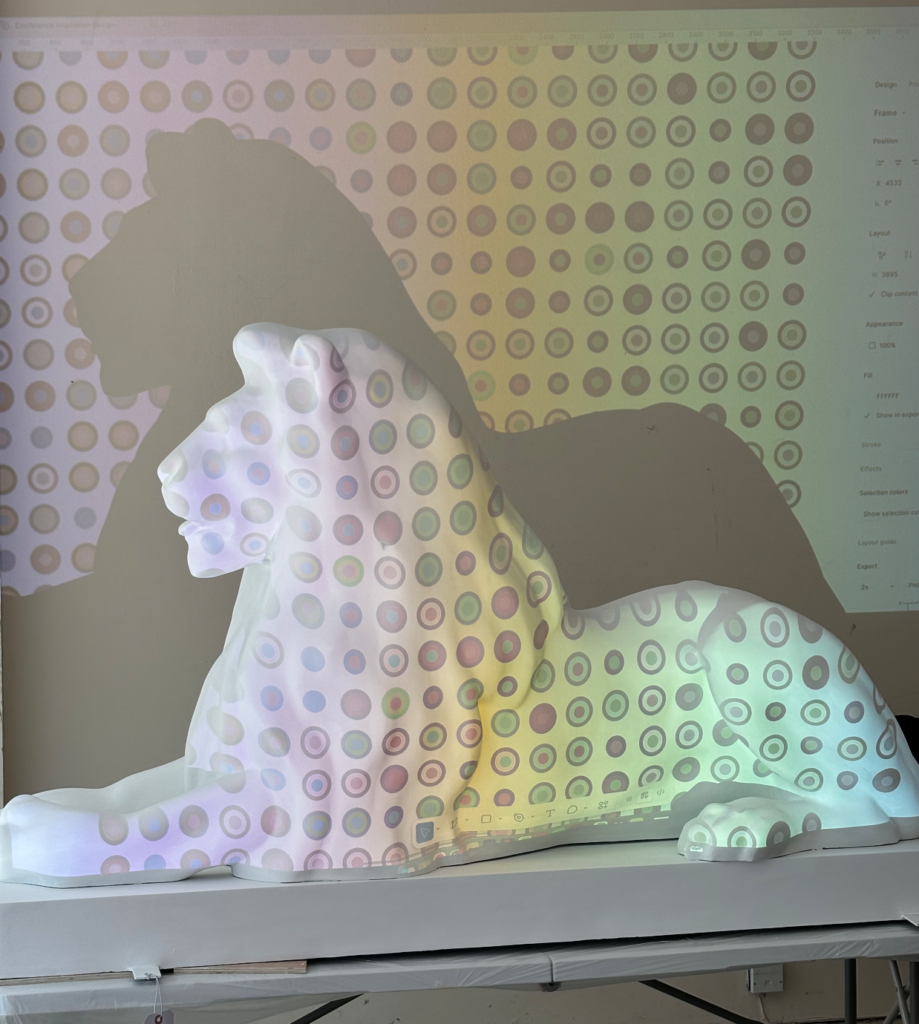
Initially, Misgav attempted to use a projector to cast her Figma-based grid onto the lion. She envisioned a perfect, high-tech transfer of pixels to fiberglass. The reality, however, was a sobering lesson in physics. The vertical angle of the projector distorted the margins, and the flat projection failed to account for the lion’s complex, organic curves. After several failed attempts with a washable marker, the surface was covered in meaningless dots. Her digital perfectionism had collapsed.

Phase 2: The "Aha" Moment
The breakthrough occurred during a mundane commute on a double-decker bus. Observing the traffic, Misgav noticed the natural, interlocking "brick-wall" pattern formed by cars in congestion. She realized that by abandoning her rigid auto-layout grid and adopting a honeycomb pattern, she could allow the data to "breathe" around the lion’s contours. With the assistance of her husband, she manually plotted the centers of 1,500 circles using flexible paper as a guide.
Phase 3: The Labor of Love
What followed was four weeks of brutal, daily labor. Misgav had to balance her PhD workload, family commitments, and the painting process. She adopted a rule of "truthfulness," ensuring every drop of paint was measured and placed. Because she was working in a communal studio filled with chatty peers, the task became an exercise in extreme, almost meditative focus. She had to count every circle out loud to ensure the accuracy of the data.

The Philosophy of Messiness
The project forced Misgav to confront the limits of modern software. In her professional life, she relies on "CTRL+Z" and the ability to snap items to a grid. In the physical world, changing a color required multiple coats of paint and hours of labor.
"Moving from the screen to the physical world was terrifying," she admits. "I learned how spoiled I was by the safety net of digital tools."

However, this "messiness" ultimately became the project’s greatest strength. The "artistic touch"—the slight variations in brushstroke and the tactile nature of the paint—gave the data a human quality that a digital screen could never replicate.
Official Responses and Public Impact
The "Pride of Portsmouth" trail has been hailed as a success by city officials and local residents alike. The "Data Lion" has become a particular point of intrigue. While some critics might argue that the piece places a high cognitive load on the viewer, the intent was never to provide a simple infographic. It is an invitation to play "data detective."

By stripping away the numerical labels and relying on pure visual language, the sculpture forces the public to engage with the statistics on their own terms. It asks them to consider their neighbors, their health, and their city’s economic reality, not as abstract numbers, but as part of a shared, tangible identity.
Implications for Data Visualization
Or Misgav’s experiment offers a compelling look at the future of data communication. The project suggests that as our lives become increasingly digital, there is a growing hunger for physical, tactile data experiences.

By grounding her work in Alberto Cairo’s five foundational pillars—specifically the requirement for "truthfulness"—Misgav has demonstrated that data art does not have to be merely decorative. It can be a rigorous, academic, and deeply personal pursuit.
As the "Pride of Portsmouth" trail continues to draw visitors, the "Data Lion" stands as a testament to the idea that data is not just about the numbers we gather, but the stories we choose to tell with them. When asked if she would undertake such a grueling project again, Misgav’s answer is unequivocal: "Where do I sign up?"

The lion, now firmly established in the public consciousness, remains a vibrant reminder that even the most complex datasets have a heart—and that when we take the time to visualize them with care, they can roar.
 Lina Irawan
  Nana
Nana  Nila Kartika Wati