
 By Muslim
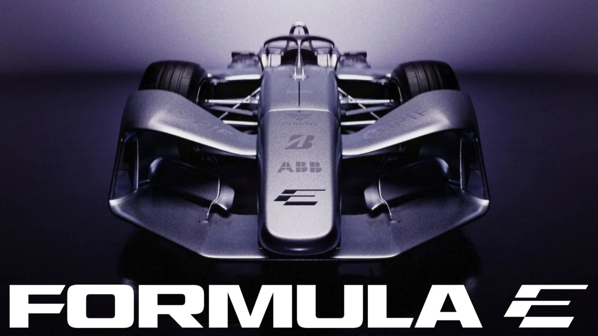
As the ABB FIA Formula E World Championship prepares to transition into its highly anticipated GEN4 era, the sport has unveiled a comprehensive, high-octane rebrand. Designed to reflect a competition that is moving faster, pushing harder, and engaging a wider global audience, the new visual identity is more than a superficial coat of paint—it is a strategic pivot designed to solidify Formula E’s position at the vanguard of sustainable motorsport.
This transition marks a departure from the aesthetics of the GEN3 era, opting for a design language that prioritizes kinetic energy, digital fluidity, and a sharp, modern edge. Crafted by the global creative practice MOX, the rebrand serves as a visual manifestation of the championship’s ambition to remain culturally relevant in an increasingly crowded sporting landscape.
The Core Transformation: A New Visual Language
The centerpiece of this transformation is a redesigned logomark that functions as a sophisticated visual double entendre. The icon cleverly weaves together the letters ‘F’ and ‘E’, tilted at a precise 30-degree angle to evoke a constant sense of forward momentum.
"Anything that feels comfortable straight away dates quickly," observes Matt Bolton, creative director and co-founder at MOX. "We went for a ‘Marmite’ icon. It throws you at first, then it grows on you, and that’s what keeps it standing up in five seasons. You read the ‘E’ immediately; the ‘F’ is what you find afterwards."
This deliberate design choice rejects the safety of traditional, static logos. By forcing the viewer to engage with the negative space and the interplay of lines, the logo demands a moment of cognitive processing, a hallmark of high-end contemporary design. The 30-degree lean is carried through the wider visual system, appearing in motion graphics, event branding, and digital interfaces, ensuring that the identity remains coherent whether it is displayed on a high-definition broadcast screen or a printed program.
Chronology: The Evolution of a Motorsport Identity
Formula E’s visual journey has been one of rapid maturation. Since its inception, the championship has navigated the challenges of proving its viability as a serious motorsport entity while simultaneously championing electric mobility.
- 2014: The Foundation: Launching with a minimalist, functional aesthetic, the inaugural branding focused on establishing the "E" as a symbol for electric energy. It was clean, efficient, and served the purpose of introducing a new format to the world.
- 2018: The GEN2 Leap: With the introduction of the Batmobile-esque GEN2 cars, the brand shifted toward a more aggressive, futuristic palette. The focus was on "innovation" and "technology," using darker hues and sharp geometric shapes.
- 2023: The GEN3 Milestone: As the cars became faster and the competition tighter, the branding matured into a more refined, professional sporting aesthetic.
- 2025: The GEN4 Precursor: The current rebrand represents the most significant shift since the sport’s inception. It moves away from "electric-only" visual clichés—like neon blue motifs and battery icons—toward a broader, high-fashion, high-performance aesthetic. This signals that Formula E no longer feels the need to justify its existence as "the electric alternative," but rather presents itself as the premier destination for cutting-edge motorsport.
Supporting Data: Why Rebrand Now?
The timing of this change is not coincidental. As Formula E enters the GEN4 phase, the technical capabilities of the cars are reaching new heights. The GEN4 machines are expected to be the most efficient and powerful electric race cars ever built, featuring regenerative braking capabilities that push the boundaries of energy management.
The rebranding project involved a deep dive into the needs of modern digital consumers. According to internal brand research, Formula E’s audience is increasingly younger, more digitally native, and heavily focused on the intersection of technology and lifestyle.
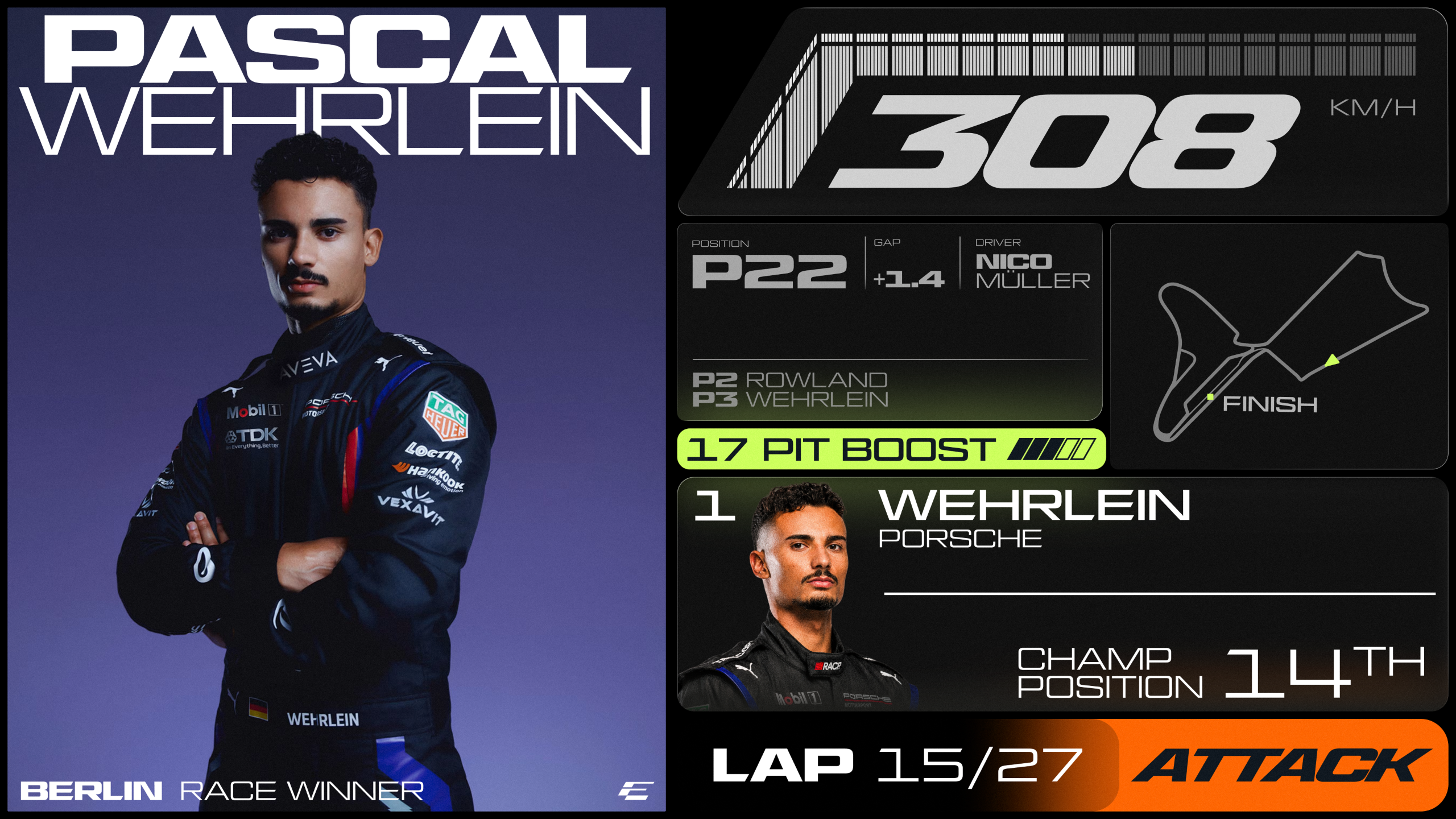
To address this, the typography—developed in collaboration with All Purpose Studio—is a masterclass in utility and style. Based on a bespoke cut of AP Gavel, the font family includes:
- Turbo Mode: A condensed, italicized variant designed specifically for high-speed motion graphics and headlines, imparting a sense of urgency.
- Micro Mono: A technical font utilized for timestamps, race data, and reference codes, giving the broadcast and app interfaces a "data-first" feel.
- Inter: A clean, highly legible typeface reserved for long-form editorial copy, ensuring accessibility across platforms.
The new color palette is equally deliberate. By introducing "Surge Purple," "Signal Orange," and "Electric Lime," the brand moves away from the monochromatic blues and whites of the past. These vibrant, high-contrast colors are optimized for digital displays, ensuring the brand pops on smartphone screens and social media feeds, which have become the primary consumption points for younger fans.
Official Perspectives: The Strategy Behind the Style
The leadership team at Formula E views this rebrand as a fundamental requirement for the sport’s continued growth. Ellie Norman, Chief Marketing Officer at Formula E, notes that the previous identity had served its purpose well but lacked the scalability required for the organization’s current trajectory.
"Our previous identity was created for an earlier stage of our journey," Norman explains. "This modern, expressive brand system matches the scale of our current ambition and gives us a powerful platform to lead the next generation of motorsport."
This sentiment is echoed by the design team at MOX, who emphasize that a brand is not just a logo, but a total experience. The system is designed to be "living," meaning it can adapt to the diverse environments in which Formula E operates, from the tight, technical street circuits of Monaco to the expansive, high-speed arenas of the future.
Implications for the Future of Motorsport
The implications of this rebrand extend beyond mere aesthetics. By adopting a "fashion-forward" design language, Formula E is positioning itself in the same sphere as premium automotive brands and luxury sports apparel. This is a crucial move in the fight for global sponsorship dollars. When a brand looks like a lifestyle label rather than a niche technical experiment, it opens doors to partnerships with major fashion, tech, and lifestyle corporations.
Furthermore, the shift toward a more modular design system suggests that Formula E is preparing for a future where broadcast rights and digital experiences are deeply integrated. The use of variable typefaces and data-optimized color systems indicates a move toward a more "gamified" viewing experience, where fans can see real-time data overlays that look as slick as they are informative.
As the championship looks toward the GEN4 era, the challenge will be to maintain this newfound stylistic edge while ensuring the core product—the racing itself—remains the undisputed hero. The branding is a promise: that the racing will be as fast, as sharp, and as exciting as the visuals that represent it.
Conclusion: A New Era of Visual Authority
Formula E’s bold move to overhaul its identity is a testament to the sport’s confidence. By embracing a design that is unapologetically modern, the organization is signaling to the world that it has graduated from the "alternative" category and is now a central player in the global sporting consciousness.
The collaboration between MOX and All Purpose Studio has resulted in a system that is flexible, readable, and undeniably cool. Whether it is the subtle, clever geometry of the new ‘FE’ mark or the aggressive, high-velocity typography of ‘Turbo Mode’, every element of the new brand identity works in concert to tell a story of progress.
As the grid prepares to unleash the GEN4 cars, the visual stage is set. Formula E has traded in its "electric" tropes for a more sophisticated, high-performance identity, proving that the future of motorsport isn’t just about what’s under the hood—it’s about how that future looks to the rest of the world. For designers, racing fans, and industry observers alike, this rebrand is a masterclass in how to evolve a global identity without losing the heart of what made it special in the first place.
 Iffa Jayyana
 Reynand Wu
 Nila Kartika Wati
