 By Iffa Jayyana
In the modern digital landscape, user interface (UI) and user experience (UX) trends are often celebrated as the ultimate indicators of product innovation. From neo-brutalist layouts and hyper-minimalist typography to hidden gesture-based navigation and immersive micro-animations, designers constantly chase novel ways to capture user attention.
However, a growing body of clinical research and product analytics reveals a sobering truth: design patterns optimized for entertainment, e-commerce, or productivity apps frequently collide with the foundational needs of mental health platforms. When applied indiscriminately to digital therapeutics and wellbeing tools, aesthetic novelty can become an active barrier to healing.

Main Facts: The Retention Crisis and the Cost of Cognitive Load
The core crisis facing mental health applications is not a lack of initial interest, but a staggering rate of abandonment. According to prominent digital health studies published in the Journal of Medical Internet Research (JMIR), nearly 95% of users who open a mental health app on Day 1 abandon it by Day 30, with a median 30-day retention rate languishing at a mere 3.3%. Even industry giants struggle to maintain engagement, losing approximately 50% of their user base within the first ten days.

This severe retention collapse highlights that interface design is not merely a surface-level aesthetic choice—it is a critical clinical and operational priority.

When users open a mental health application, they rarely do so out of idle curiosity. More often, they arrive in a state of high cognitive strain: stressed, anxious, overwhelmed, or exhausted. In these vulnerable states, an unconventional icon, a confusing hidden menu, or a flashy, non-skippable animation ceases to be a delightful surprise. Instead, it becomes an additional layer of cognitive overload, prompting the user to close the app and abandon it permanently.

Chronology: The Evolution of Trend-Driven mHealth and the Shift Toward Contextual Design
- Early 2010s (The Rise of Generic Wellness Tools): Digital mental health emerged primarily as an extension of general fitness tracking. Early apps relied on standard, clinical-looking interfaces that lacked emotional resonance, leading to low initial adoption.
- Mid-to-Late 2010s (The Gamification Boom): Developers began importing engagement loops from gaming and productivity apps—incorporating aggressive streaks, daily notifications, and colorful badges to drive retention. While effective for habit-forming apps, these mechanisms frequently induced guilt and performance pressure in vulnerable users.
- 2020–2023 (The Aesthetic Overhaul and Neo-Brutalist Wave): Driven by portfolio-centric design trends popularized on platforms like Dribbble, apps increasingly prioritized visual novelty, high-contrast neo-brutalism, and complex abstract controls over accessibility and ease of use.
- 2024–Present (The Call for Empathetic Evaluation Frameworks): Industry practitioners and researchers, led by design experts such as Kat Homan, began advocating for a fundamental paradigm shift. The focus has transitioned from chasing visual fashion to evaluating whether interface patterns actively lower cognitive costs for distressed users.
Supporting Data: Understanding the Distressed User
To understand why trend-driven design frequently fails in mHealth, product designers must evaluate user psychology against empirical data regarding cognitive capacity:

- The Scale of Need: The World Health Organization (WHO) estimates that approximately one billion people globally live with a mental disorder, with depression alone affecting nearly 5% of adults. Over the past decade, cases of anxiety and depression have surged by 25%.
- The Preference for Subtlety: Research investigating color and aesthetic psychology in mHealth apps demonstrates that users in distress exhibit a strong preference for subtlety. Sleek, sophisticated dark palettes and uncluttered aesthetics are favored over bright, hyper-cheerful colors, which can create a jarring emotional mismatch with a depressed or anxious user’s internal reality.
- Accessibility Demographics: Populations requiring mental health support disproportionately overlap with individuals experiencing visual, motor, or cognitive impairments. Low-contrast minimalist text, gesture-only navigation, and dense animated layouts systematically exclude these users.
Official Responses: Clinical Perspectives on Digital Therapeutics
Mental health organizations and academic researchers have increasingly spoken out against the uncritical adoption of commercial engagement metrics within clinical spaces.

Public health frameworks, such as those outlined by the WHO regarding digital mental health transformation, emphasize that digital tools must prioritize equity, accessibility, and psychological safety. Clinical psychologists note that traditional retention mechanics—such as punitive streak counters or urgency-driven push notifications—misunderstand the non-linear nature of recovery.

When a user dealing with severe depression or burnout misses a day, framing that absence as a "broken streak" or a personal failure undermines therapeutic trust. Official guidelines increasingly stress that digital interventions must act as a "quiet helper"—respectful, reliable, and entirely free of coercive pressure.

Implications: A Practical Evaluation Framework for Designers
To bridge the gap between aesthetic innovation and therapeutic utility, designers working in the mental health and emotional wellbeing space must adopt a rigorous evaluation framework. Before introducing any trendy visual or interaction pattern, product teams should subject the design to a five-point diagnostic test:

1. Cognitive Friction
- The Question: Does the design lower the barrier to entry when the user has the least cognitive capacity to spare?
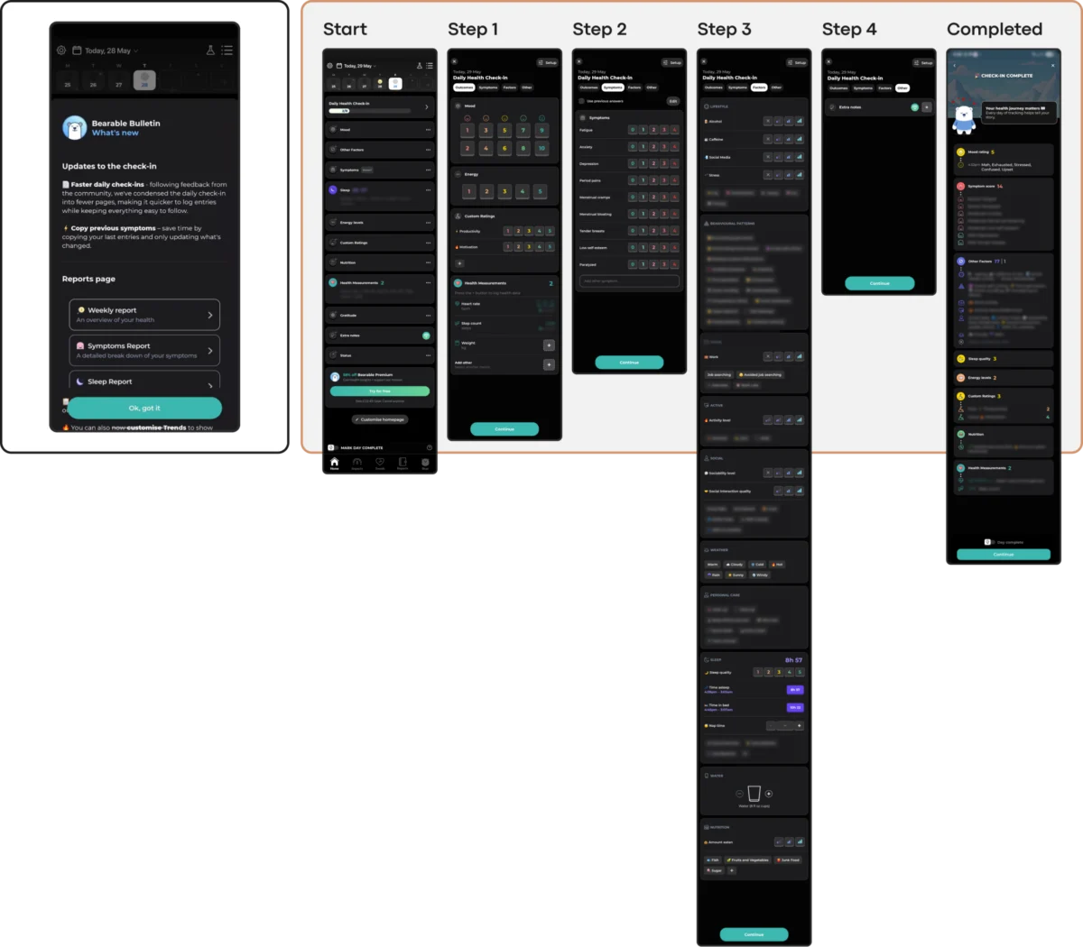
- The Fix: Prioritize linear flows, clear entry points (such as dedicated "Quick Relief" or panic-support buttons), and low-friction inputs like voice dictation as alternatives to exhaustive typing.
2. Emotional Mismatch
- The Question: Does the visual and functional tone align with the user’s likely emotional state?
- The Fix: Avoid toxic positivity and jarringly bright, saturated color palettes if the product serves overwhelmed users. Opt instead for grounded, muted, and emotionally resonant color schemes that offer a sense of refuge.
3. The Inconsistency Penalty
- The Question: Does the interface rely on novelty at the expense of predictable routine?
- The Fix: Maintain a stable information architecture. Ensure that core support features remain in predictable locations so returning users do not have to "solve a puzzle" during moments of acute stress.
4. Silent Exclusion (Accessibility)
- The Question: Does the aesthetic choice comply with core accessibility standards (WCAG 2.2)?
- The Fix: Guarantee sufficient contrast ratios (at least 4.5:1 for body text), ensure interactive targets meet minimum size requirements, and always provide visible button fallbacks for complex gesture controls.
5. The Coercion Paradox
- The Question: Do engagement mechanisms feel like supportive care or performance pressure?
- The Fix: Replace punitive streaks with forgiving, flexible tracking systems that celebrate return rather than penalizing absence. Ensure monetization prompts (such as paywalls or upgrade screens) are never triggered during critical, acute support workflows.
Conclusion
In the realm of mental health technology, sustainable retention is earned not by capturing attention through fleeting visual trends, but by becoming a consistently respectful and helpful presence in a user’s life.

While design awards are frequently given to visually striking Dribbble shots, true success in digital therapeutics is measured away from the screen—in the quiet moments of relief experienced by a user who found support without added friction. Ultimately, the goal of mental health UI design is not to make the interface seen, but to ensure the support is profoundly felt.
 Nila Kartika Wati
 Evan Lee Salim
 Reynand Wu
