
 By Nana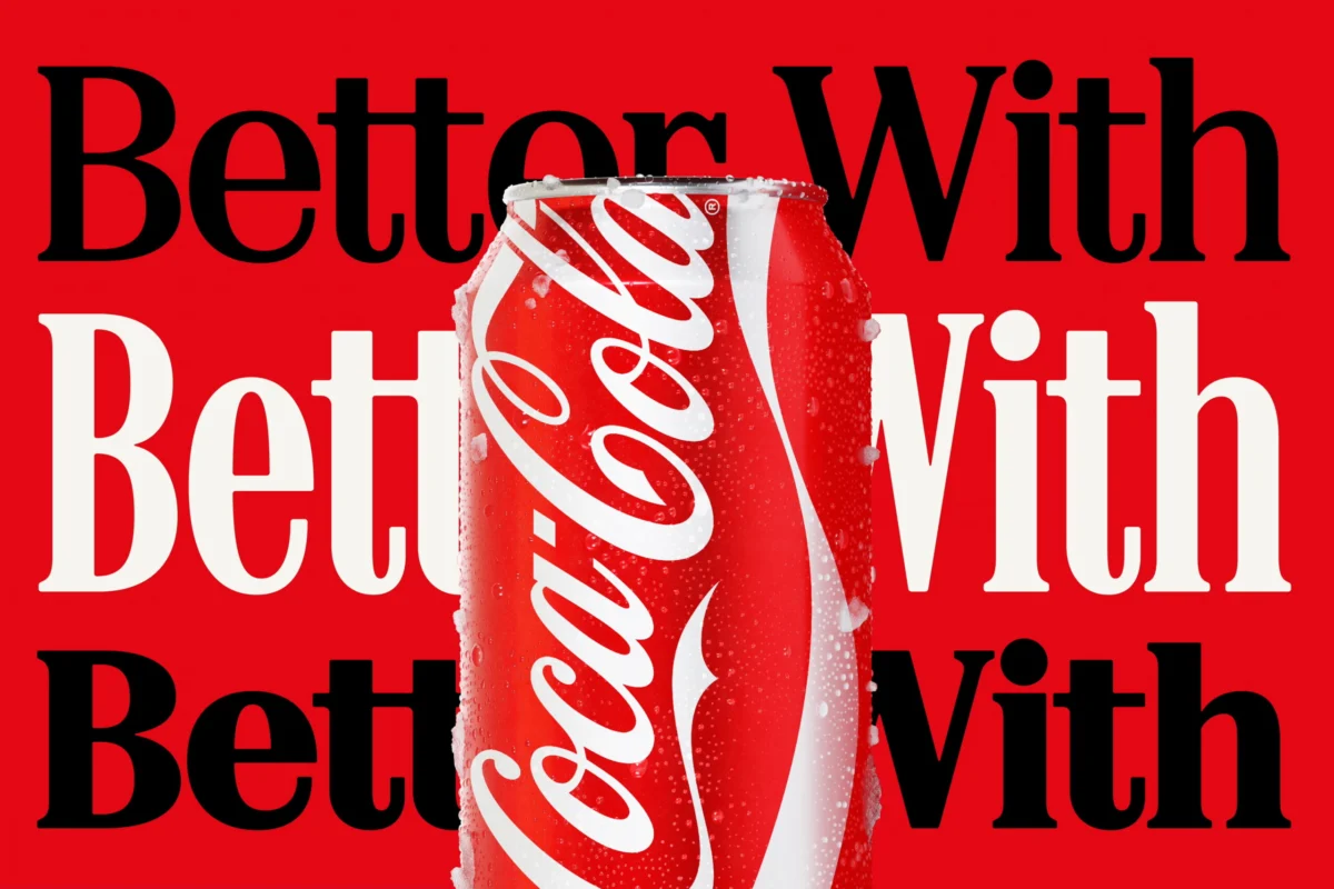
Atlanta, GA – [Current Date] – Coca-Cola, one of the world’s most recognizable and enduring brands, has recently rolled out a comprehensive brand identity overhaul, masterminded by the renowned design agency JKR. While the redesign aims to inject a renewed sense of dynamism and heritage into the beverage giant’s visual language, one particular element has inadvertently sparked a global conversation, drawing comparisons to an unexpected and controversial counterpart: Marlboro cigarettes. At the heart of this discussion is the prominent new "Better With" typeface, crafted by Brody Associates, which critics and casual observers alike have quickly noted bears an uncanny resemblance to the iconic serif font long associated with the tobacco behemoth.
The unveiling of Coca-Cola’s refreshed visual system, which places a strong emphasis on typography, has become less about its intended message of brand evolution and more about a perplexing juxtaposition. Social media platforms have been abuzz with users highlighting the striking visual parallel, often accompanied by a sense of irony given the contrasting health narratives surrounding sugary drinks and tobacco products. This incident underscores the profound impact of design choices in an increasingly interconnected and health-conscious world, where even the most subtle visual cues can ignite widespread debate and shape public perception in unforeseen ways.
Main Facts: A Refresh Sparks Unexpected Parallels
Coca-Cola’s latest brand identity, a sweeping design overhaul led by JKR, aimed to consolidate its global visual presence and reinforce its core values. A cornerstone of this ambitious rebrand is the enhanced prominence of the "Better With" typeface, meticulously developed by Brody Associates. This elegant, retro-inspired serif font, initially introduced in 2023 for a holiday campaign, has now been elevated to a central role across all of Coca-Cola’s marketing materials and packaging, signaling a deliberate strategic shift towards a more unified and typographically driven aesthetic.
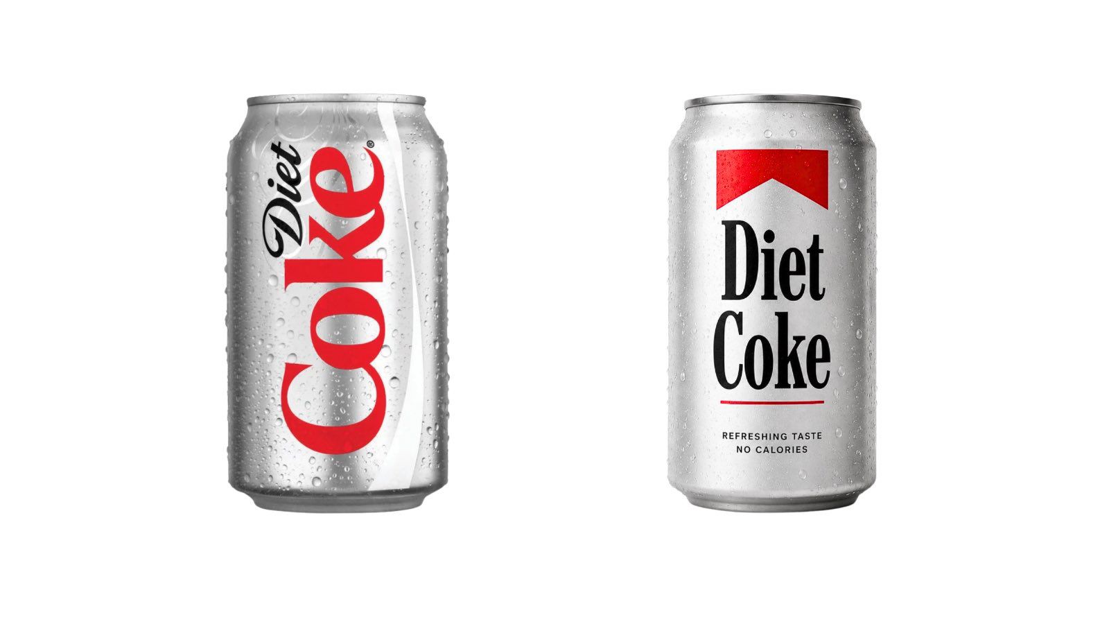
However, almost immediately upon its wider deployment, the distinctive serifs and classic proportions of the "Better With" font began to trigger an unanticipated wave of recognition among consumers and design aficionados. The comparison to Marlboro cigarettes’ long-established typeface was swift and widespread, quickly dominating online discussions. While design experts affirm that the fonts are not identical, the visual congruence is undeniable, particularly when viewed in isolation or in mocked-up comparisons that quickly went viral.
The irony of a brand synonymous with refreshment and sugary indulgence appearing to draw design cues from one of history’s most famously addictive and health-detrimental products has not been lost on the public. Many social media commentators have seized upon this perceived visual echo as a poignant, if unintentional, commentary on contemporary public health debates, where concerns about the health impacts of excessive sugar consumption are frequently equated with historical campaigns against tobacco. This unforeseen parallel has thrust Coca-Cola’s design choices into a spotlight far more intense than perhaps originally intended, forcing a re-evaluation of how visual branding can inadvertently carry broader societal implications.
Brody Associates, the design studio behind the "Better With" typeface, articulated their creative process as an effort to imbue the brand with a "unique personality, movement, and playfulness." They stated, "Inspired by the company’s archive, we blended Coca-Cola’s rich serif font heritage with modern-day requirements, adding another layer of storytelling to the brand through typography." This statement suggests a conscious decision to tap into Coca-Cola’s historical visual language, implying that any resemblance to other brands was unintentional and a byproduct of their exploration of classic serif styles. However, the public reaction highlights the inherent risks in such design explorations, particularly for brands with such immense global visibility and cultural significance.
A Chronology of Brand Evolution and Public Perception
The journey of Coca-Cola’s "Better With" typeface from a seasonal campaign element to a core brand identifier, and its subsequent controversial reception, offers a compelling timeline of modern branding dynamics.
The New Identity Unveiled: A Strategic Overhaul
The broader brand identity overhaul by JKR represents a significant strategic move for Coca-Cola. It aims to streamline the brand’s diverse portfolio under a unified aesthetic, enhancing consistency across various products and global markets. This initiative builds upon previous efforts to consolidate the "Coca-Cola" master brand, moving away from disparate identities for Diet Coke, Coke Zero, and other variants. The focus on typography, and specifically the "Better With" font, was intended to be a sophisticated, heritage-driven element that could evoke both nostalgia and contemporary relevance. The overall design language sought to be more fluid, dynamic, and consumer-centric, leveraging a combination of classic elements and modern sensibilities to appeal to a broad demographic.
The ‘Better With’ Typeface’s Genesis: From Holiday Cheer to Core Identity
The "Better With" typeface first made its debut in 2023 as part of a festive holiday campaign. Its initial application was limited, lending a charming, celebratory feel to seasonal promotions. The decision to elevate this specific font to a central position within the entire brand identity speaks to Coca-Cola’s perceived success of its initial reception and its potential to embody the brand’s essence year-round. Brody Associates’ mission was to craft a serif font family that could "express the brand’s unique personality, movement, and playfulness," drawing inspiration from Coca-Cola’s extensive archival typography. This historical reference point is crucial, as many classic serif fonts share common design principles that could, by coincidence, echo other brands’ choices. The transition from a campaign-specific font to a foundational brand asset indicates a deliberate, long-term commitment to this particular typographic style.
Social Media Erupts: The Viral Comparison
The moment the new packaging and marketing materials featuring the "Better With" font began appearing widely, social media platforms became the primary arena for public discourse. Screenshots of Diet Coke cans juxtaposed with Marlboro cigarette packs, often featuring fan-made mock-ups directly applying Marlboro-style branding to Coca-Cola products, rapidly went viral. Tweets and posts like, "new diet coke just dropped" alongside images of the Marlboro-esque Diet Coke can, or "Coca-Cola switching to a Marlboro font lookalike is the most self-aware thing a sugar company has ever done," quickly accumulated thousands of likes and shares. The speed and virality of these comparisons highlight the power of collective visual recognition and the immediate, unfiltered nature of online commentary. The "fridge cigarette" meme, which playfully compares the habitual and often guilt-laden consumption of Diet Coke to the act of smoking, provided a pre-existing cultural context that amplified the perceived irony of the font choice. This meme, popular on platforms like TikTok, effectively primed a segment of the audience to view the two products through a similar lens of "guilty pleasure" or addiction.
Historical Context of Brand Redesigns: A Risky Endeavor
Brand redesigns, especially for global titans like Coca-Cola, are inherently risky ventures. History is replete with examples of major brands undergoing significant visual overhauls that have met with mixed, or even overwhelmingly negative, public reactions. Gap’s disastrous 2010 logo change, Tropicana’s short-lived packaging redesign in 2009, or even Pepsi’s various rebrands over the decades, serve as cautionary tales. These incidents underscore that consumers often develop deep emotional connections to established brand visuals, and any deviation can be met with resistance or, in this case, unexpected interpretations. The challenge for designers is to innovate while respecting brand heritage and anticipating the myriad ways a new design might be perceived in a saturated and culturally complex marketplace.
Supporting Data and Industry Context
The controversy surrounding Coca-Cola’s "Better With" typeface is not merely a superficial design debate; it taps into deeper currents of branding psychology, public health awareness, and the cultural resonance of typography.
Typography as a Potent Brand Identifier
Typography is far more than just text; it is a fundamental pillar of brand identity, capable of conveying personality, tone, and heritage in a single glance. Brands like Coca-Cola and Marlboro have leveraged distinctive typefaces for decades to build instant recognition and foster strong emotional connections with their consumers. Marlboro’s iconic serif font, with its bold, authoritative, and somewhat rugged aesthetic, has become synonymous with a certain image – often associated with masculinity, freedom, and an outlaw spirit. This deep entrenchment in popular culture means that any typeface bearing a strong resemblance will inevitably trigger associations with the original brand, regardless of intent. For Coca-Cola, tapping into a "rich serif font heritage" means navigating a landscape where many classic serif styles have been adopted and imbued with meaning by other prominent brands. The inherent power of typography lies in its ability to communicate subconsciously, shaping perceptions even before a product is consumed or a message is consciously processed.
The Health Narrative: Sugar vs. Tobacco
The most potent element of the controversy is the perceived linkage between a sugary beverage and a tobacco product, set against the backdrop of escalating public health concerns. In many countries, including the UK, governments have introduced a "sugar tax" on sugary drinks, a policy explicitly designed to curb consumption due to growing rates of obesity, diabetes, and other related health issues. This legislative action mirrors historical efforts to regulate and tax tobacco products, reflecting a societal shift in how unhealthy consumption is viewed and addressed. Public health campaigns frequently highlight the detrimental effects of excessive sugar intake, drawing parallels to the long-understood dangers of smoking.
The "sugar is the new cigarette" analogy, while perhaps an oversimplification, reflects a genuine concern among health advocates and a growing segment of the public. When a brand like Coca-Cola, which has faced scrutiny over its sugar content for years, adopts a typeface visually reminiscent of Marlboro, it inadvertently feeds into this narrative. It creates a visual dissonance that some interpret as either a colossal oversight or, more cynically, a subconscious acknowledgment of the addictive nature of their product. This convergence of design and public health discourse amplifies the stakes for Coca-Cola, making the font choice a subject of serious discussion rather than just aesthetic critique.
The Psychology of Brand Association: Unintended Echoes
Brand association is a powerful psychological phenomenon where consumers link a brand with certain attributes, emotions, or even other brands, sometimes unconsciously. When visual elements, such as a typeface, strongly resemble those of another prominent brand, these associations can be triggered. For Coca-Cola, a brand built on positive emotions, refreshment, and joy, an association with tobacco — a product increasingly demonized for its health risks — presents a significant challenge. Even if the resemblance is coincidental, the human brain is wired to find patterns and make connections. This cognitive bias means that the visual similarity, especially amplified by social media, can forge a new, potentially negative, association in the minds of consumers. The fact that both brands also heavily utilize strong reds and whites in their overall branding further compounds this visual echo, creating a holistic sensory experience that reinforces the comparison.
The Role of Nostalgia and Retro Aesthetics: A Double-Edged Sword
Brody Associates explicitly mentioned drawing inspiration from Coca-Cola’s "rich serif font heritage" and blending it with "modern-day requirements." This embrace of retro aesthetics and brand archives is a common strategy in contemporary design, aiming to evoke nostalgia and a sense of timelessness. However, nostalgia can be a double-edged sword. While it can connect consumers to a brand’s storied past, it can also inadvertently link to other products or eras, sometimes with unintended consequences. The serif styles popular in older eras were diverse, and many brands, including tobacco companies, adopted robust, classic serifs for their packaging. By reaching back into its own "archive," Coca-Cola may have inadvertently selected a style that, while historically relevant to its own brand, also shares stylistic DNA with other, less desirable, associations from that same period. This highlights the delicate balance designers must strike when leveraging historical aesthetics in a modern context.
Official Responses and Expert Commentary
In the wake of the public outcry, the official response from Coca-Cola regarding the Marlboro typeface comparison has been notably absent, leaving Brody Associates’ initial statement as the primary insight into the design intent. However, the broader implications have not escaped the attention of design experts and public health advocates.
Coca-Cola’s Stance: Emphasizing Heritage Over Coincidence
While Coca-Cola itself has not issued a direct statement addressing the Marlboro comparison, the earlier comments from Brody Associates offer a glimpse into the company’s likely position. Brody Associates emphasized that the "Better With" font was crafted to "express the brand’s unique personality, movement, and playfulness," explicitly drawing inspiration from "the company’s archive" to "blend Coca-Cola’s rich serif font heritage with modern-day requirements." This narrative firmly grounds the typeface in Coca-Cola’s own history, suggesting that any resemblance to other brands is purely coincidental, a byproduct of exploring classic serif styles that were prevalent in various industries during certain historical periods. The implication is that the design choice was internal-facing, focused on their brand’s legacy, rather than an external-facing, comparative decision. Their silence on the controversy itself could be interpreted as a strategy to avoid legitimizing the comparison and to allow the news cycle to run its course.
Design Industry Perspectives: A Calculated Risk or Unforeseen Oversight?
Within the design community, opinions on Coca-Cola’s new typeface are varied. Some branding strategists and graphic designers acknowledge the visual similarity but attribute it to the inherent nature of classic serif fonts. "It’s a strong, classic serif, and many iconic brands, including Marlboro, have used similar robust serif styles historically," explains Sarah Jenkins, a veteran brand consultant. "The challenge for a brand as ubiquitous as Coca-Cola is that every design choice is magnified and scrutinized. While the intent was likely to evoke heritage, the execution has unfortunately stumbled into an awkward association."
Others view it as a significant misstep in brand guardianship. "For a global brand of Coca-Cola’s stature, with a seemingly infinite budget for design, such an oversight is puzzling," remarks Michael Chen, a typography expert. "Pre-release testing should have flagged this resemblance immediately. It speaks to a potential disconnect between the design team and broader cultural perceptions, particularly around health narratives." Some suggest it might even be a bold, albeit risky, move. "Perhaps they saw the ‘fridge cigarette’ meme and decided to lean into the subversive irony," posits Alex Rivera, a cultural branding analyst. "It’s a provocative thought, but for a brand that typically plays it safe, it’s an unexpected gambit that could either fall flat or resonate with a cynical, self-aware audience."
Public Health Advocates’ View: A Troubling Echo
For public health organizations and advocates, the visual link between Coca-Cola and Marlboro is deeply concerning. Dr. Eleanor Vance, a spokesperson for a leading anti-sugar advocacy group, expressed dismay. "At a time when we are fighting an obesity epidemic and pushing for clearer labeling and reduced sugar consumption, to see a major beverage company adopt a visual language that echoes a tobacco brand is, at best, incredibly tone-deaf and, at worst, subtly normalizing unhealthy consumption patterns by linking them to products with known addictive qualities," she stated. "Even if unintentional, the optics are terrible and send a confusing message to consumers, particularly younger generations." These groups are likely to leverage this controversy to further their arguments for stricter regulations on sugary drink marketing, viewing it as another example of how powerful brands navigate and sometimes exploit consumer psychology.
Implications and Future Outlook
The controversy surrounding Coca-Cola’s new "Better With" typeface carries significant implications, not only for the brand itself but also for the broader landscape of global branding, public health discourse, and the ever-evolving dynamics of digital communication.
Brand Image and Consumer Trust: A Delicate Balance
For Coca-Cola, a brand meticulously built over a century on positive associations, the unintended resemblance to Marlboro presents a delicate challenge to its carefully curated image. While the direct financial impact might not be immediate, the erosion of brand trust or the introduction of a dissonant association could have long-term consequences. Consumers are increasingly scrutinizing corporate responsibility, particularly concerning health and wellness. If a segment of the public perceives Coca-Cola as being insensitive to these concerns, or even subtly acknowledging the addictive nature of its products through design, it could alienate health-conscious consumers and complicate its efforts to diversify into healthier beverage categories. Maintaining a pristine brand image in an era of heightened social awareness requires meticulous attention to every detail, including the nuances of typography.
The Power of Social Commentary: Shaping Brand Narratives
This incident powerfully illustrates the unprecedented power of social media in shaping brand narratives in real-time. What might have once been a niche discussion among design professionals now instantaneously becomes a global conversation, fueled by memes, viral posts, and collective commentary. Brands no longer solely control their narratives; they are co-created with, and often challenged by, their audience. The speed with which the Marlboro comparison spread and the depth of the subsequent discussion underscore the importance for global brands to not only conduct thorough design testing but also to anticipate and monitor public perception across diverse cultural and digital landscapes. A seemingly minor design choice can quickly escalate into a significant public relations challenge if it resonates with pre-existing cultural anxieties or satirical observations.
Lessons for Global Brands: Design in a Connected World
The Coca-Cola typeface controversy offers crucial lessons for all global brands. Firstly, design decisions, especially for universally recognized entities, must be evaluated through multiple lenses: aesthetic appeal, brand heritage, and, critically, potential external associations. In a world saturated with visual information, it’s increasingly difficult to create something entirely novel without inadvertently echoing existing iconography. Secondly, the context of public health and societal values is paramount. As concerns about sugar, obesity, and other lifestyle diseases continue to mount, brands must be acutely aware of how their messaging and visual language interact with these critical debates. What might seem like an innocent aesthetic choice can be interpreted as a broader statement about corporate responsibility or even a cynical nod to unhealthy consumption. Finally, proactive engagement and transparency, even in the face of controversy, can be more effective than silence. Acknowledging the public’s observations and reiterating the brand’s core values could potentially mitigate negative perceptions.
The Unintended Irony: A Lasting Impression
Ultimately, the new "Better With" typeface, intended to symbolize Coca-Cola’s playful heritage and modern aspirations, has instead become a lightning rod for discussions about corporate branding, public health, and the pervasive influence of visual culture. The unintended irony of a sugary drink brand adopting a font strikingly similar to that of a tobacco giant will likely endure as a memorable case study in branding missteps. Whether this episode ultimately proves to be a fleeting social media storm or a more lasting blemish on Coca-Cola’s otherwise sparkling image remains to be seen. What is clear, however, is that in an era where every pixel can be dissected and every design choice scrutinized, the visual language of a brand carries a weight far beyond its mere aesthetic appeal, echoing societal anxieties and shaping perceptions in profound and often unpredictable ways.
 Evan Lee Salim
  Ammar Sabilarrohman