
 By Layla Zulfa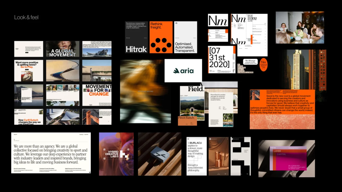
Main Facts: The Hidden Crisis in Modern Brand Identity Design
In the contemporary design landscape, the failure of a branding project rarely stems from a lack of technical skill or aesthetic sensibility. Instead, industry experts and senior design strategists are increasingly identifying a "silent killer" of creative work: the semantic gap between strategy and execution. This phenomenon occurs when high-level brand strategy—defined by nebulous adjectives such as "modern," "trustworthy," and "disruptive"—is handed over to designers without a concrete visual translation.
The result is often a catastrophic misalignment. When a client asks for a "premium" feel, they may envision a minimalist, quiet luxury, while the designer interprets the word as high-contrast, gold-foiled opulence. To combat this, a growing movement within the design community advocates for the "pre-concept" phase. This critical period, occurring after the initial strategy is set but before a single pixel is moved in tools like Figma, focuses on uncovering hidden assumptions, researching brand context, and establishing a shared visual vocabulary between stakeholders and creatives.
The pre-concept phase is not merely a preliminary moodboard; it is a rigorous, structured methodology designed to turn abstract brand pillars into a functional visual foundation. By defining the "design code" before the concept stage, agencies can reduce revision cycles by up to 50% and ensure that the final identity is not just a creative "guess," but a logical extension of the business’s core goals.
Chronology: From Strategy to Visual Foundation
The traditional workflow of branding has long followed a linear path: Brief → Strategy → Concept → Delivery. However, this model often leads to a "reveal" moment where the client is surprised—and not always pleasantly—by the designer’s interpretation. The modernized "Pre-Concept" workflow introduces a strategic buffer to ensure alignment.
1. The Kickoff and Initial Discovery
The process begins with the standard collection of business goals, competitor audits, and audience personas. At this stage, the team identifies the primary tension points the brand must resolve (e.g., "How do we look innovative without appearing unstable?").
2. The Research of Context (The Deep Dive)
Rather than moving straight to sketches, the team enters the research phase. This involves investigating how the brand’s chosen adjectives function within their specific industry. It is here that the team discovers that "modern" in the medical sector looks vastly different from "modern" in the gaming industry.

3. The Stakeholder Workshop (Active Alignment)
In mid-project, designers facilitate workshops using tools like Competitor Perception Mapping and Visual Brand Drivers. These exercises are designed to force disagreements to the surface early, allowing the team to resolve conflicting visions of the brand’s future.
4. The Visual Foundation Meeting
Before the final identity concepts are developed, a "Visual Foundation" is presented. This includes Look and Feel boards, Design Codes, and Asset Directions. This serves as a "working layer" that confirms the boundaries of the design territory.
5. Concept Development
Only after the visual foundation is approved does the designer begin the actual creation of logos, typography systems, and color palettes. Because the boundaries are already set, this stage becomes an exercise in refinement rather than a shot in the dark.

Supporting Data: Unpacking the "Semantic Gap"
The necessity of the pre-concept phase is underscored by the inherent ambiguity of language. In professional branding, words are often "too broad to guide design decisions."
The "Disruptive" Paradox
Consider the case of a health-tech firm seeking to "disrupt" the market. In a vacuum, "disruption" might suggest neon colors, brutalist typography, and chaotic layouts. However, data-driven research into the brand’s context revealed that their primary clients were conservative government medical institutions. In this specific context, "disruption" needed to be communicated through extreme clarity and efficiency—a visual "calm" that stood out against the cluttered, legacy systems of competitors. The "disruptive" look, therefore, ended up appearing more traditional than the word initially suggested.
The Psychology of Perception
According to industry benchmarks, perception sits at the center of brand discovery because a brand is ultimately formed in the mind of the consumer. To quantify this, designers utilize "Perception Questions" during the pre-concept phase:

- Credibility: Where does the brand need to feel "safe" or "established"?
- Differentiation: Which category norms should be challenged, and which should be followed?
- The "Vibe" Check: If the brand were a physical space or an object, what would its attributes be?
By moving from abstract adjectives to concrete metaphors, teams can navigate the "Visual Brand Driver" exercise. For example, if a stakeholder chooses a "high-speed train" to represent their company, they are signaling a desire for reliability, structure, and mass accessibility. If they choose a "private jet," they are signaling exclusivity and speed. These choices provide designers with a tangible "design code" that words alone cannot provide.
Official Responses: Expert Perspectives on Strategic Design
The shift toward a pre-concept-heavy workflow is supported by some of the most influential voices in the design and branding world.
Marty Neumeier, author of The Brand Gap, famously stated, "A brand is a person’s gut feeling about a product, service, or company." This definition places the burden of design not on the logo itself, but on the feeling it evokes. Neumeier’s philosophy suggests that if a designer does not manage the "gut feeling" through a pre-concept phase, the resulting brand identity will be fundamentally disconnected from the user experience.

Jake Knapp, the creator of the Google Ventures "Design Sprint," emphasizes the importance of making the abstract concrete as early as possible. In his "Three-Hour Brand Sprint" methodology, Knapp argues that exercises like the "20-Year Roadmap" and "Brand Personality Sliders" are essential because they force stakeholders to make difficult decisions before the visual work begins. "The point of these exercises," Knapp notes, "is to make the abstract idea of ‘our brand’ into something concrete."
Leading design studios now argue that the designer’s role has evolved from a "creator of assets" to a "facilitator of clarity." By using pre-concept reference boards, designers allow clients to react to visual principles and early asset directions before significant time is invested in full concepts. This collaborative approach fosters a sense of ownership among stakeholders, reducing the likelihood of late-stage "pivot" requests.
Implications: The Future of Brand Identity and Client Relations
The adoption of a rigorous pre-concept phase carries significant implications for the design industry, the client-agency relationship, and the longevity of brand systems.

1. Shift from Subjective to Objective Evaluation
One of the most profound implications of the pre-concept phase is the change in how design is critiqued. When a team agrees on a "Design Code" (e.g., "Parenting is messy and magical" translates to "soft gradients and playful irregularity"), the subsequent concept reviews move away from personal preference. The question is no longer "Do I like this blue?" but rather "Does this blue express the ‘trustworthy but modern’ foundation we agreed upon?"
2. Efficiency and Reduced Waste
The pre-concept phase acts as a filter. By identifying what a brand is not—for instance, identifying that a fintech brand should be "bold" but never "rebellious"—designers avoid spending dozens of hours on unusable directions. This leads to higher profitability for agencies and faster time-to-market for clients.
3. Enhanced Brand Consistency
Because the pre-concept phase establishes the "building blocks" (typography styles, photo direction, graphic language) early on, the resulting brand identity is often more robust and easier to scale. Product teams can use the "Design Code" as a North Star when building out digital interfaces, social media assets, and physical environments, ensuring a unified brand experience across all touchpoints.

4. The "Democratization" of Strategy
By involving stakeholders in exercises like Competitor Perception Mapping, the strategy becomes a shared journey. This transparency builds trust and ensures that the final identity is supported by the entire leadership team, not just the marketing department.
In conclusion, the strongest visual concepts do not begin in design software. They are forged in the "pre-concept" phase—a space of intense research, strategic questioning, and visual experimentation. By bridging the gap between what a brand means and how it looks, designers can move past the era of "guesswork" and into an era of high-impact, strategically aligned brand identity. The first concept should never be a surprise; it should be the inevitable conclusion of a well-defined journey.
 Nana Wu
  Nana
Nana 