
 By Asep Darmawan
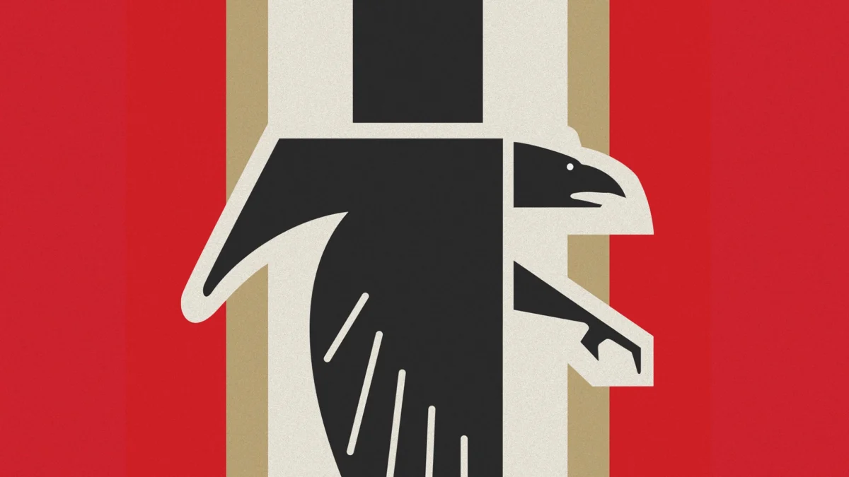
In the high-stakes world of professional sports branding, visual identity is everything. It is the shorthand for a team’s heritage, its competitive spirit, and its connection to its fanbase. However, for the Atlanta Falcons, a recent attempt to celebrate that very heritage has backfired, igniting a digital firestorm that questions the boundaries between retro aesthetics and unintended, highly offensive visual associations.
The franchise, in its pursuit of nostalgia, has revived a 1960s-era logo design that has drawn sharp, widespread criticism for its striking resemblance to the iconography of the Third Reich. While the team claims the design is a harmless homage to their inaugural season, the public outcry—fueled by social media scrutiny—suggests that in the modern era, context and cultural sensitivity are just as important as the design itself.
The Chronology of a Branding Blunder
To understand the current controversy, one must look at the trajectory of the Falcons’ visual identity over the past several years.
The 2024 Initial Resurgence
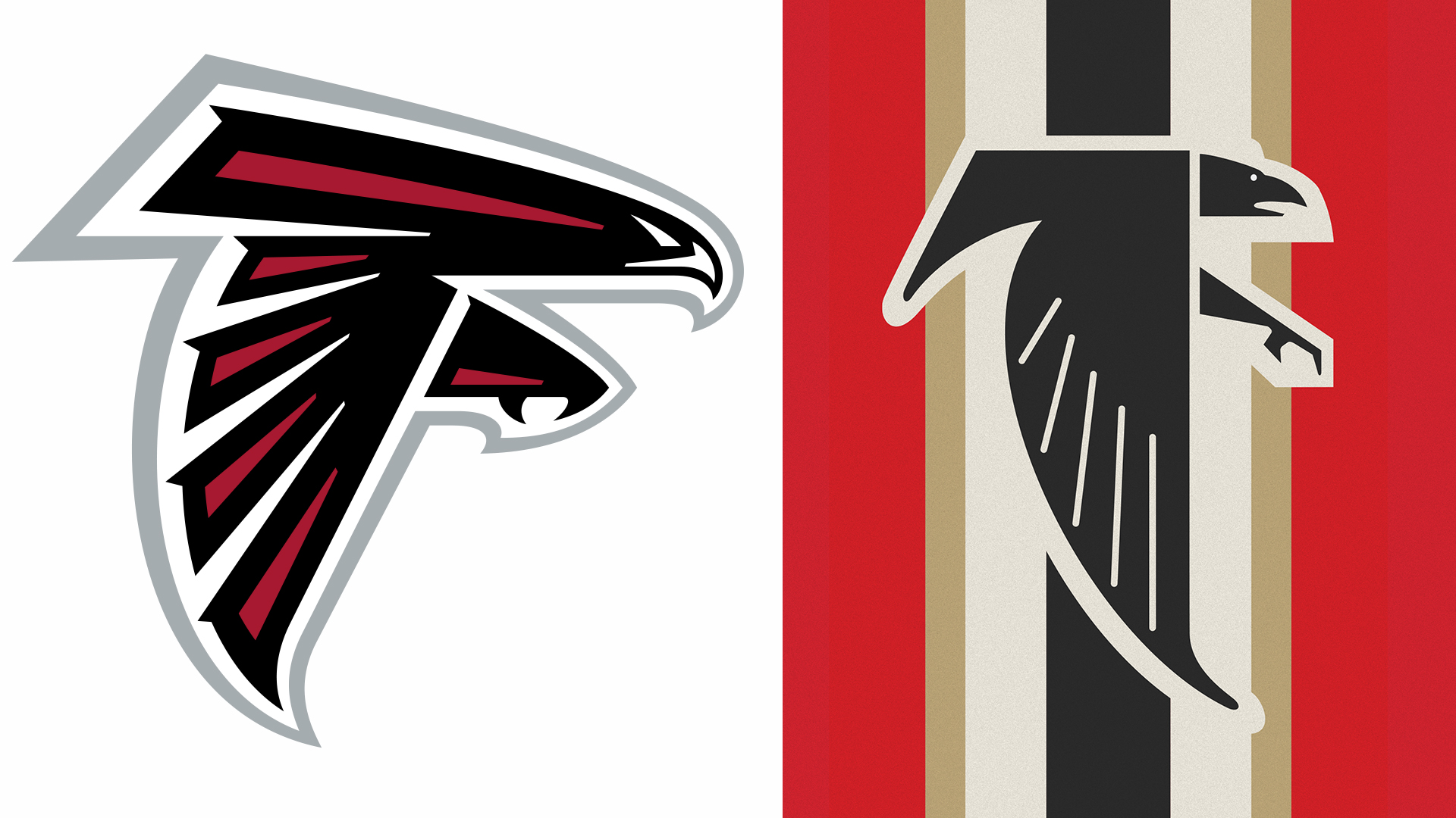
Two years ago, the Atlanta Falcons began integrating elements of their 1960s identity into their marketing and merchandise. At the time, the logo—a rigid, angular falcon depicted in a stark black-and-red palette—raised eyebrows among design critics and fans alike. While the team justified the move as a “throwback” to their founding era, critics pointed out that the hard, geometric stylization of the bird of prey, combined with its sharp, aggressive posture, echoed the aesthetic sensibilities of fascist propaganda from the 1930s.
The 2026 "Doubling Down"
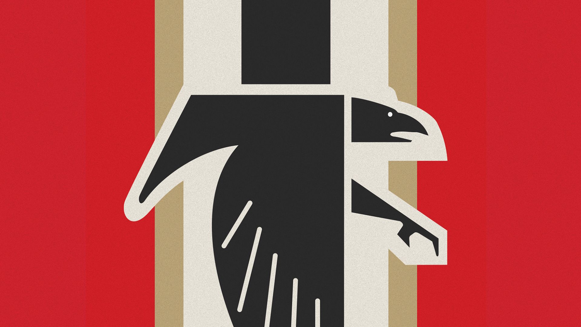
Rather than distancing themselves from the criticism, the Falcons appear to have doubled down. In anticipation of this weekend’s matchup against the San Francisco 49ers, the team unveiled a refreshed digital presence, updating their profile picture to feature the controversial falcon icon set against a backdrop of vertical stripes in cream, beige, black, and red.
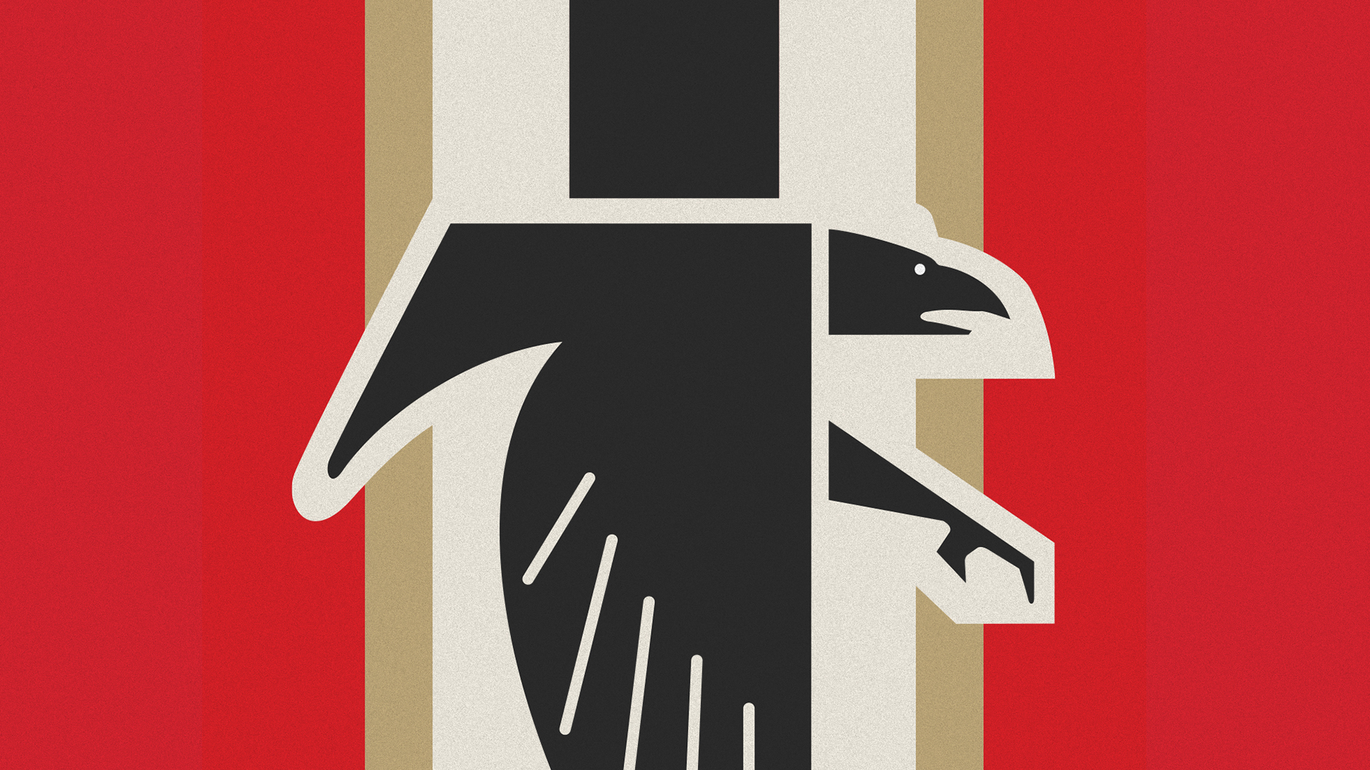
The addition of these stripes, intended to evoke the textures of vintage uniforms, has inadvertently acted as a visual accelerant. The new composition, which frames the falcon in a way that suggests a heraldic cross, has led to a torrent of memes and comparisons across social media platforms, with users mockingly dubbing the logo the "Bird Reich."
The Anatomy of the Criticism
The backlash has been swift and unforgiving. On platforms such as X (formerly Twitter), the design has been dissected by amateur historians and graphic designers alike. The core of the complaint lies in the unintended semiotics of the logo.
Visual Semiotics and Public Perception
Graphic design is a language of association. When a logo utilizes a sharp-angled, black avian motif positioned on a high-contrast, multi-striped field, it inherently triggers visual patterns associated with mid-20th-century totalitarian emblems.
"I read that the NFL wanted to conquer the world, but I didn’t think they meant it so literally," one viral post noted. The sentiment reflects a broader frustration among fans who feel that the team’s creative department either failed to perform due diligence or ignored the obvious optics of the design.
The Role of Social Media in Design Policing
In the 1960s, when the logo was first conceived, the media landscape was vastly different. A logo was viewed on a stadium scoreboard or a printed program. Today, every design choice is subject to "infinite zoom" and viral deconstruction. The speed at which a brand’s image can be memed into a political controversy means that organizations are no longer just competing on the field; they are competing in the arena of cultural perception. The "Bird Reich" label is not just a joke; it is a manifestation of how quickly a brand can lose control of its narrative.
Contextualizing the "Throwback" Defense
To be objective, the Atlanta Falcons are not the first organization to inadvertently tread on dangerous visual ground. The history of graphic design is replete with shapes and symbols that predate their darkest historical associations.
The History of the Bird of Prey
The eagle and other birds of prey have been symbols of power, majesty, and national pride since the Roman Empire. The United States government itself utilizes the bald eagle as a primary symbol of sovereignty. The Falcons argue that their logo is an extension of this long-standing tradition of using predatory birds to represent strength in sports.
However, the defense of "historical usage" often ignores the reality of modern visual literacy. A symbol does not exist in a vacuum. If a logo happens to mirror the geometric precision and color palette of a regime universally condemned for its atrocities, the intent behind the design becomes secondary to the impact it has on the viewer.
The "Stripes" Problem
The most significant error in the 2026 iteration was the inclusion of the vertical stripes. In design, the "frame" matters as much as the subject. By placing the falcon atop a patterned background that mimics the rigid, uniform appearance of vintage flags or banners, the design team moved from "retro sports aesthetic" into the realm of "totalitarian iconography." It is difficult to argue that this was a complete oversight given the feedback received two years ago.
Official Responses and Internal Silence
As of the time of writing, the Atlanta Falcons organization has maintained a largely stoic, if not silent, posture regarding the controversy. While the team has continued to promote their 1966-inspired uniforms—which feature red helmets, black jerseys, and white pants—they have not issued a formal statement addressing the "Bird Reich" comparisons.
In professional sports, this "wait and see" approach is standard. Organizations often hope that the controversy will dissipate once the game concludes and the "throwback weekend" ends. However, the digital footprint of this event will likely persist, potentially influencing future branding decisions. The question remains: at what point does the cost of maintaining a "retro" aesthetic outweigh the benefit of brand consistency and public goodwill?
Implications for Future Sports Branding
The Atlanta Falcons’ situation serves as a cautionary tale for the sports industry at large. As teams look for ways to monetize nostalgia through retro merchandise and branding, they must navigate a increasingly complex landscape of cultural sensitivity.
The Need for Cultural Audits
Large organizations employ massive marketing departments, yet they frequently miss obvious visual landmines. The Falcons’ situation suggests a need for "cultural audits" of design assets. This process involves testing new branding against a diverse focus group or a panel of historians to identify potential associations that might be obvious to an outsider but invisible to an internal team blinded by their own project goals.
The Burden of Brand Heritage
Is it time for the NFL and its teams to retire designs that are inherently divisive, regardless of their historical origins? The debate over the Washington Commanders’ previous name and branding proved that the league is capable of radical change when the pressure is sufficient. While a logo is not a team name, it is the primary vessel for a team’s identity. If that vessel becomes associated with a dark chapter of history, it loses its ability to inspire the very fans it was meant to represent.
The Evolution of the Fanbase
Modern sports fans are more socially conscious than their predecessors. They are not merely passive consumers of merchandise; they are active participants in the brand’s story. When a team ignores the feedback of its base, it risks alienation. The memes and public ridicule are, in essence, a form of fan-led governance. By ignoring these warnings, the Falcons are signaling a disconnect between the front office and the community that sustains them.
Conclusion: The Price of Nostalgia
The Atlanta Falcons’ current predicament is a classic case of the "nostalgia trap." In attempting to honor the history of the 1966 season, the team has inadvertently reopened a wound in public discourse. While the organization likely intended nothing more than a celebration of its origins, the execution has highlighted a fundamental disconnect between historical design and modern perception.
Design, in its most powerful form, is a medium of communication. When the intended message (strength, tradition, heritage) is obscured by a more potent, unintended message (fascist imagery, totalitarian aesthetics), the communication has failed. Whether the team chooses to pivot, apologize, or continue to ride out the storm, the "Bird Reich" incident will be remembered as a pivotal moment in the history of sports branding—a reminder that in the 21st century, every pixel carries the weight of history.
As the Falcons head into this weekend’s game, they do so under the shadow of a design choice that has become a lightning rod for criticism. It serves as a reminder to all creative professionals: when reaching back into the past for inspiration, one must be careful not to resurrect the ghosts that are best left forgotten.
 Reynand Wu
 Nila Kartika Wati
 Nana Muazin
